
MISSED CALL
Task & Challenge
The task was to create the label for MISSED CALL, a new gin brand by Vilniaus degtinė, one of the oldest and largest spirits producers in Lithuania and the Baltic States. The label needed to establish a distinctive identity for the new brand, reflect the drink’s British character and create an emotional connection with the consumer. In a saturated craft gin market, the challenge was to develop a design that would stand out on the shelf and capture attention at first glance.
Solutions
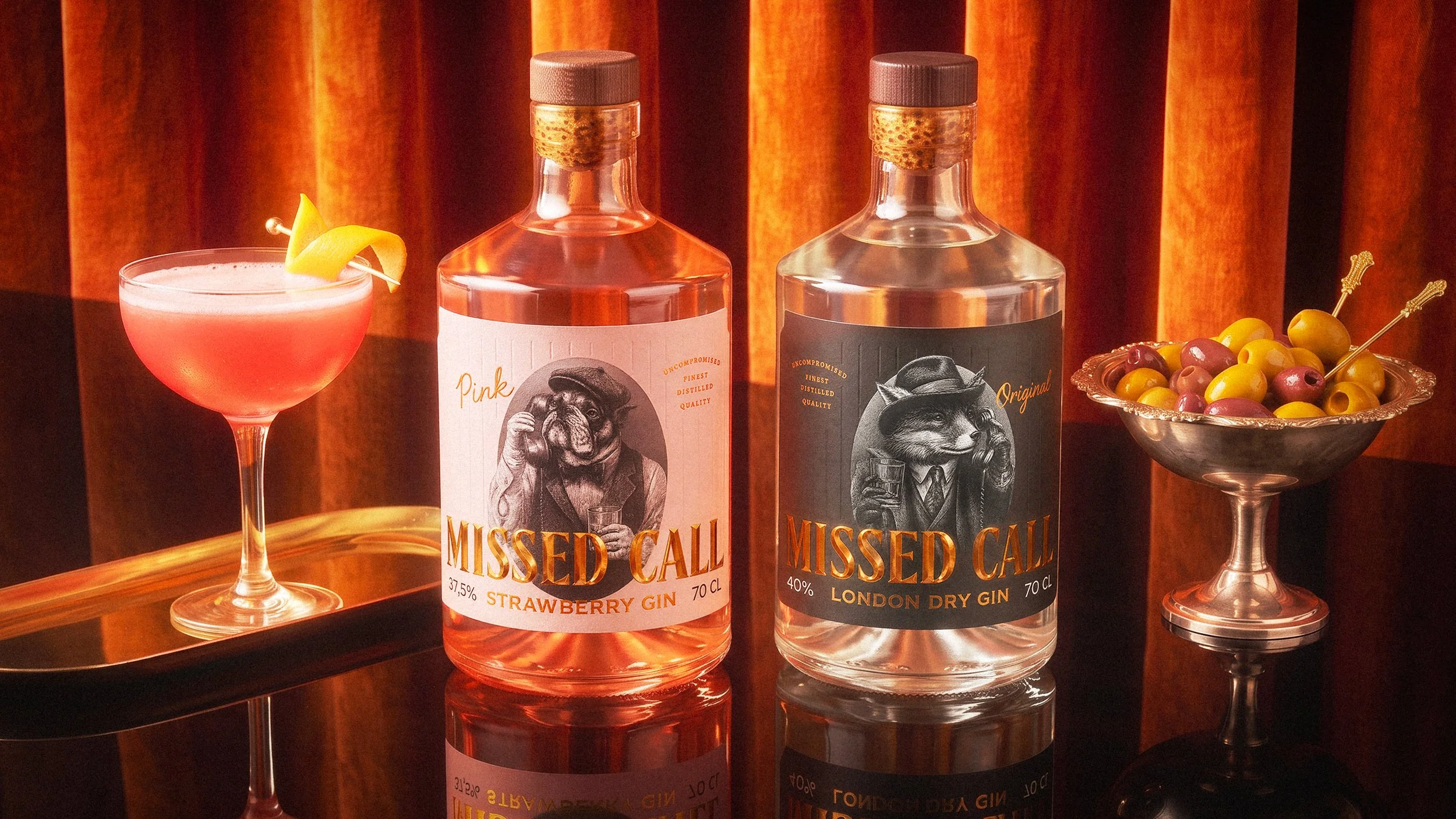
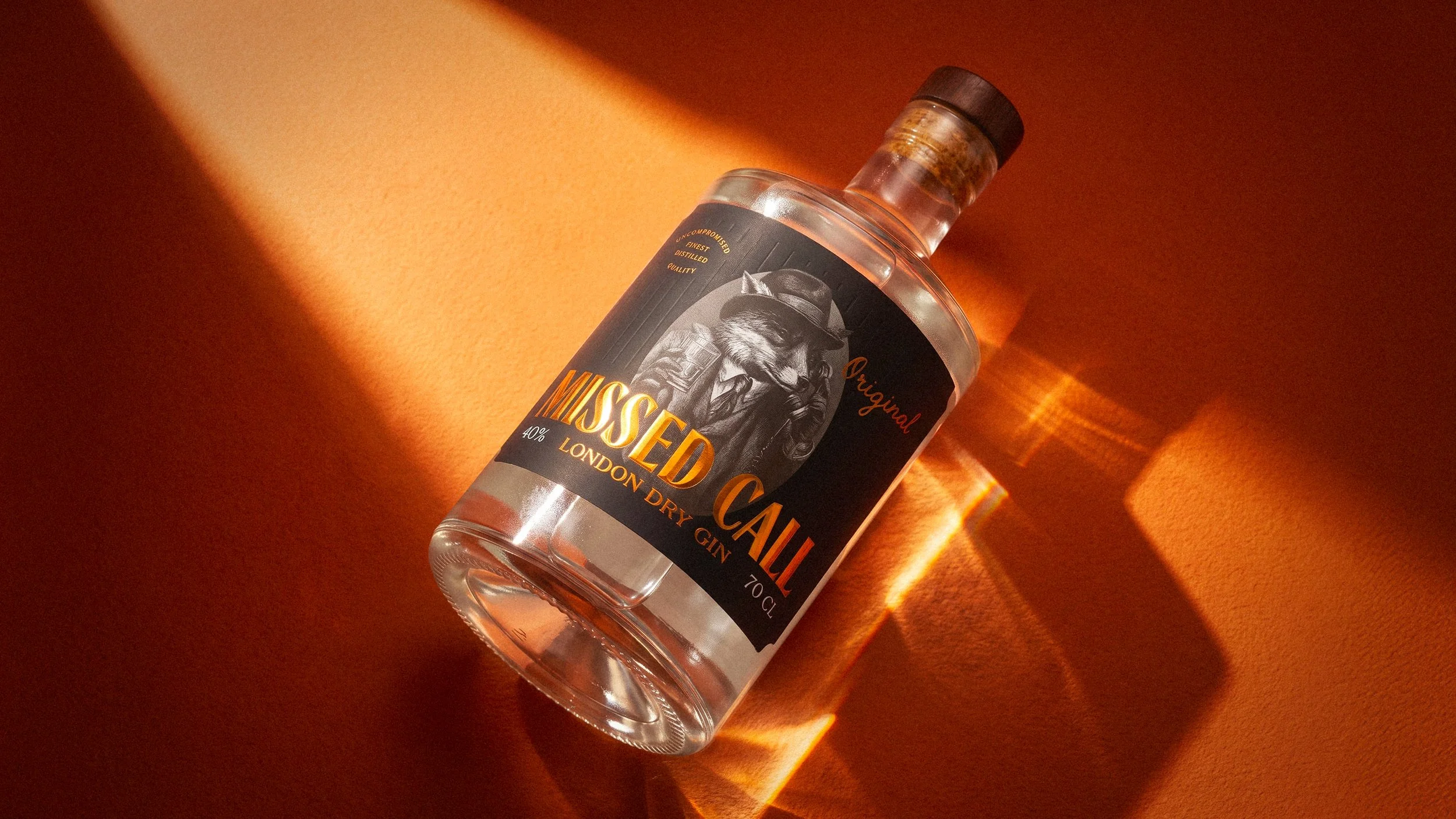
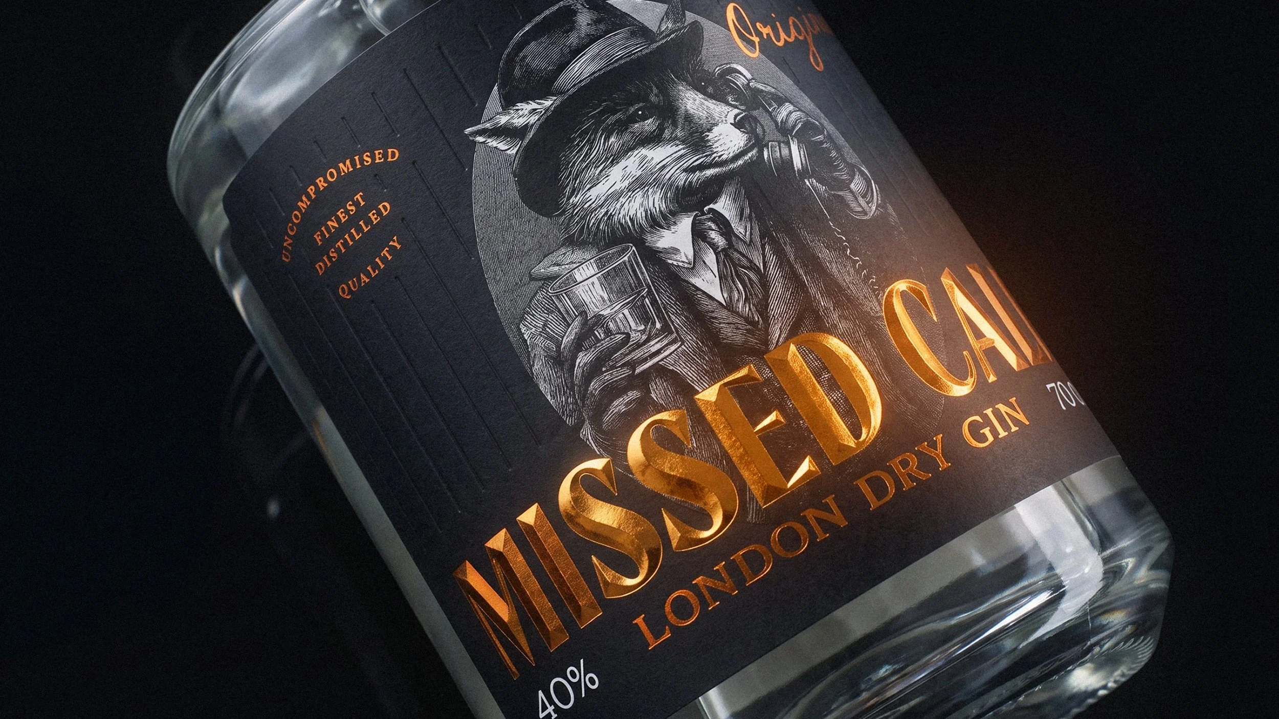
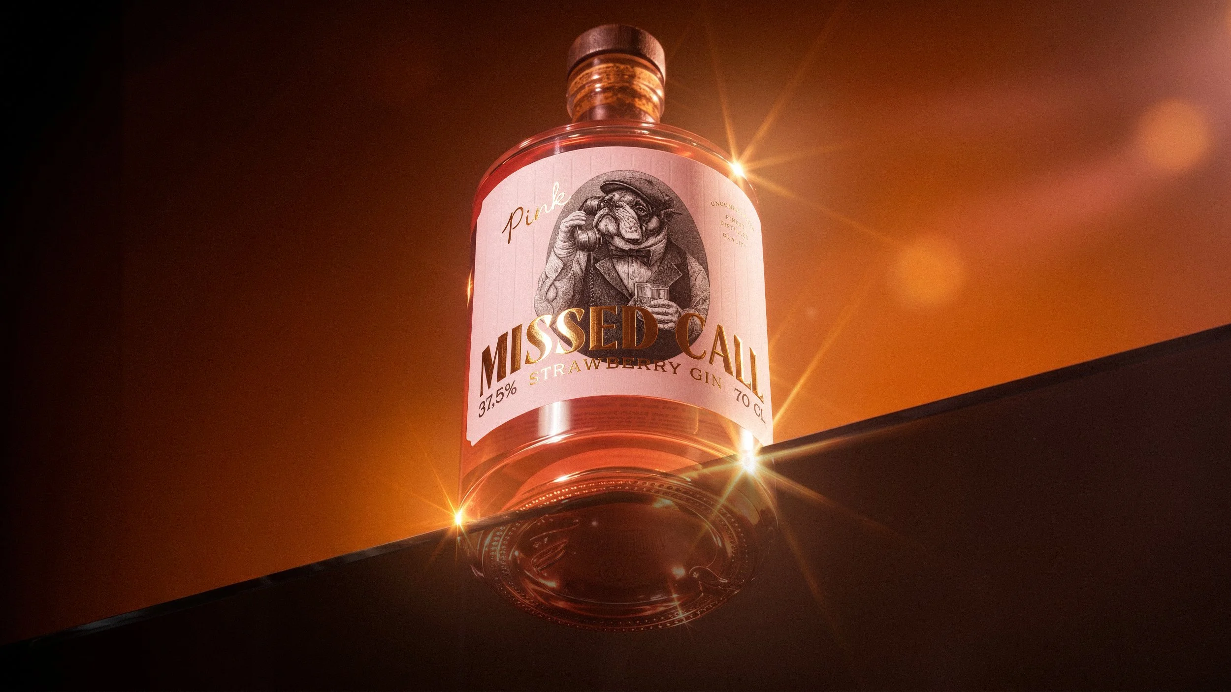
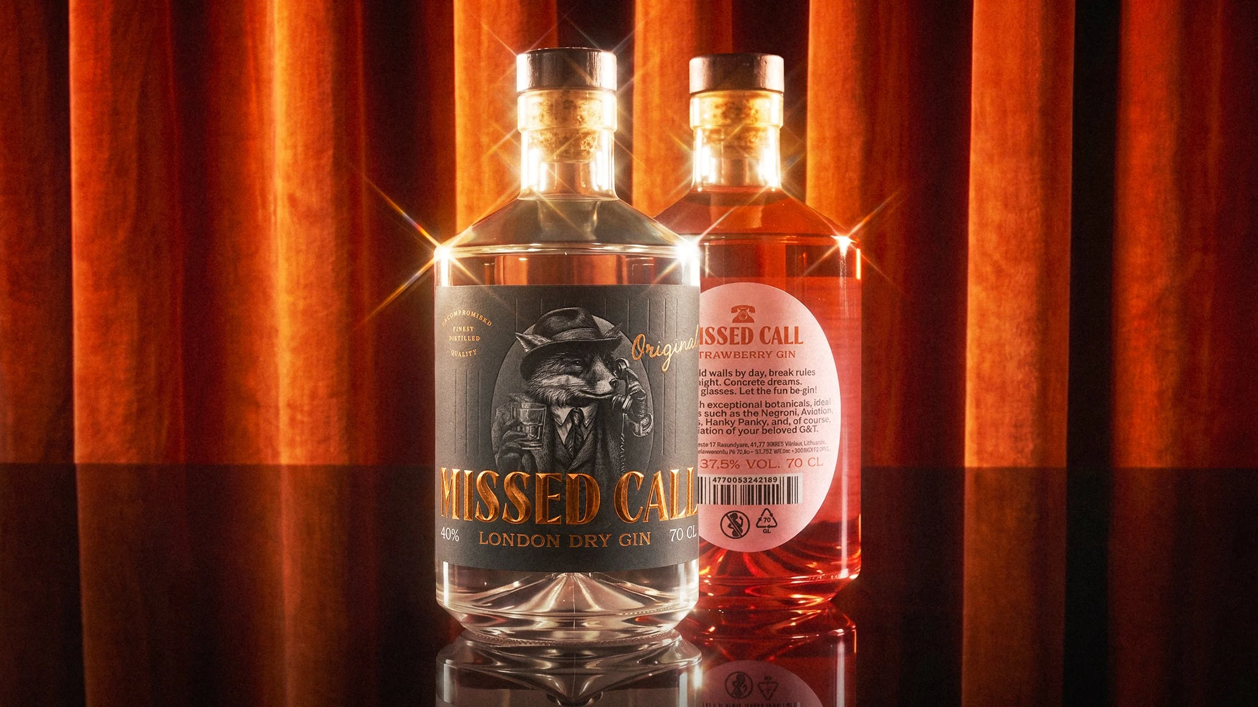
With gin’s history closely associated with Great Britain, we chose recognisable British icons – the fox and the bulldog – as the main characters of the brand. The phone motif creates a playful story of interaction between them, while the positioning of the bottles on the shelf allows the characters to appear as if they are trying to reach one another.
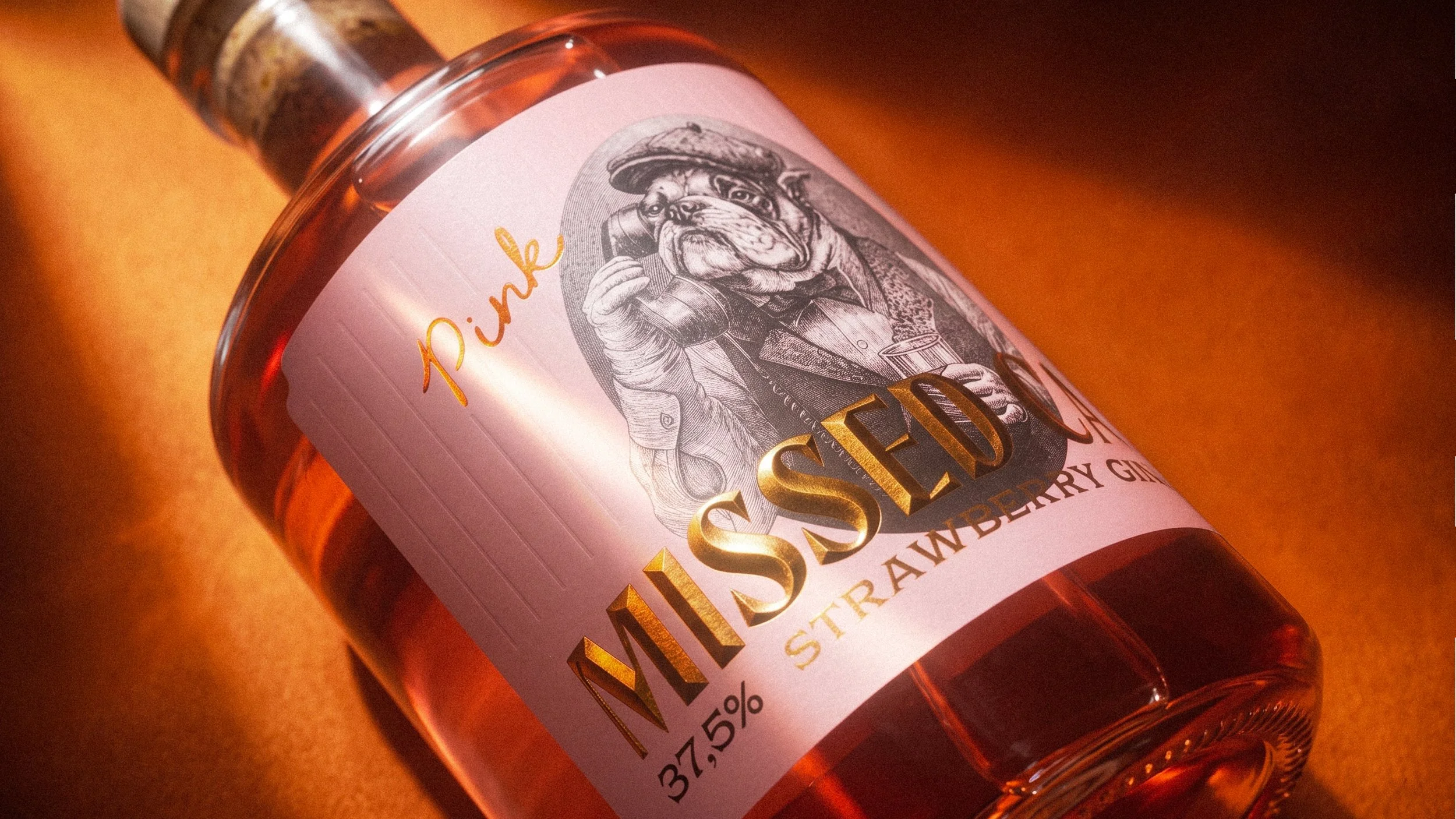
An oval frame creates a strong focal point, while the illustrations deliberately extend beyond its borders, adding depth and making the characters feel more present and engaging.
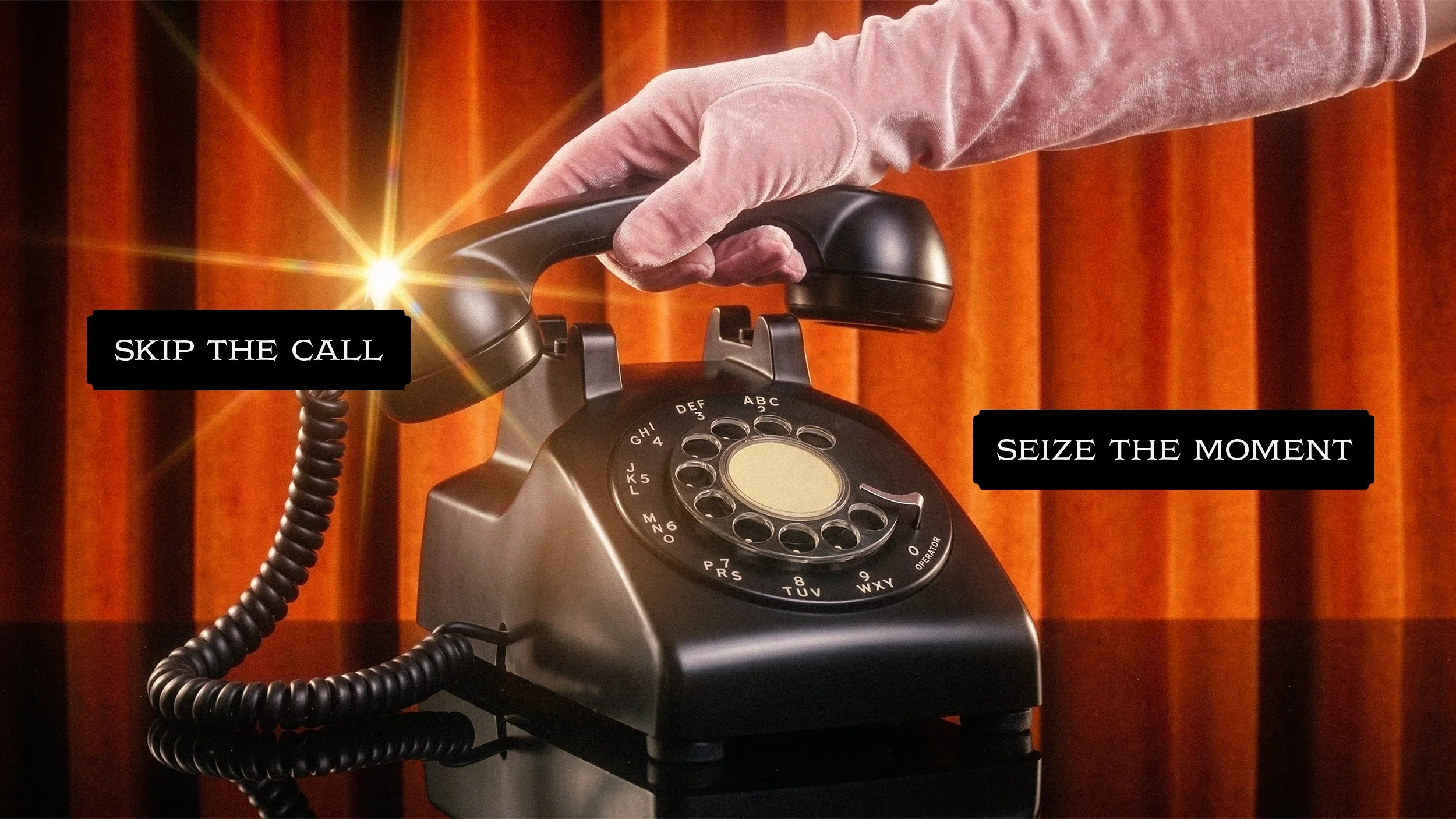
Each character holds a phone, introducing a playful interactive element to the packaging. Depending on the orientation of the bottles, the characters can appear to be calling or interacting with one another, turning the shelf into part of the visual narrative.
The concept was designed as a flexible system that can easily expand into future flavour variations through new characters associated with Great Britain. This allows the identity to grow while maintaining a consistent visual language across the range.
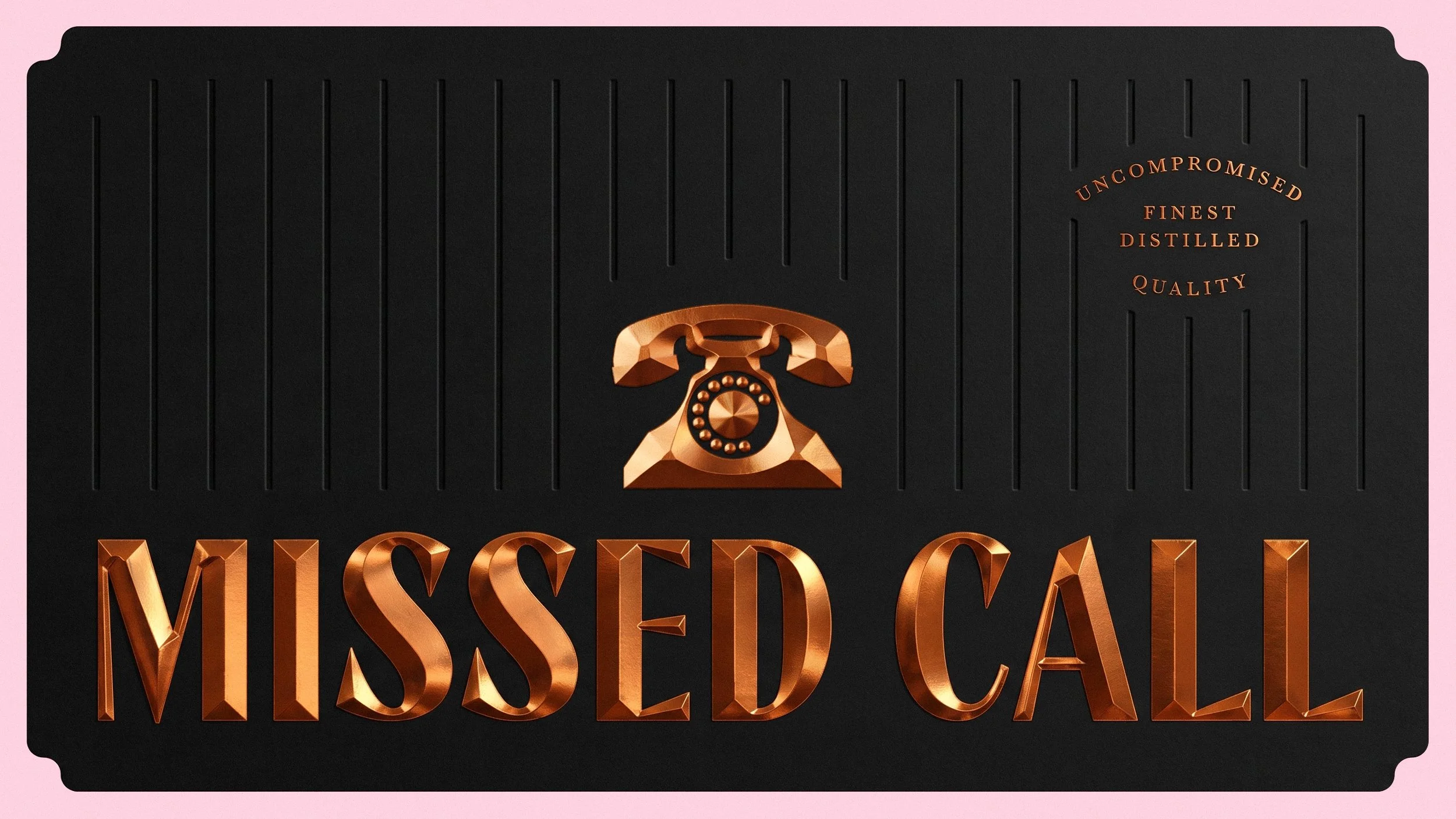
Copper foil and 3D embossing on the brand name add a premium touch without overshadowing the main characters. The result is a bold and memorable label that combines storytelling, interaction and a distinctive visual identity.
Art Direction
Label Design
Illustration
Packaging Design
Packaging System
What’s Golden?
MISSED CALL turns a simple brand name into a playful visual story. The combination of recognisable British characters, phones and an interactive bottle composition creates an identity that is immediately recognisable and encourages a second look.
The illustrations give the gin a distinctive personality, while the British-inspired characters provide a clear connection to the product’s intended heritage. The result is a bold and memorable label system with enough flexibility to grow into a wider range of flavours and characters.
Credits
Art Direction & Graphic Design: Ugnė Akstinaitė
Project manager: Lilė Adomaitė
Great&Golden © 2026