
KKF
Task & Challenge
Kėdainių konservų fabrikas (KKF) is the oldest and one of the largest producers of mayonnaise, sauces and canned goods in the Baltic States. As a market leader in Lithuania, the brand has strong consumer recognition our objective was to refresh the product labels by modernising their look while preserving the core brand elements, maintaining recognisability and enhancing shelf appeal.
With a wide product portfolio, the existing design system relied heavily on a dominant, uniform colour, making it difficult to differentiate individual products and create strong shelf visibility. Since changing the established label shapes was not an option, the redesign also had to work within existing spatial limitations while communicating each product’s taste clearly.
Solutions
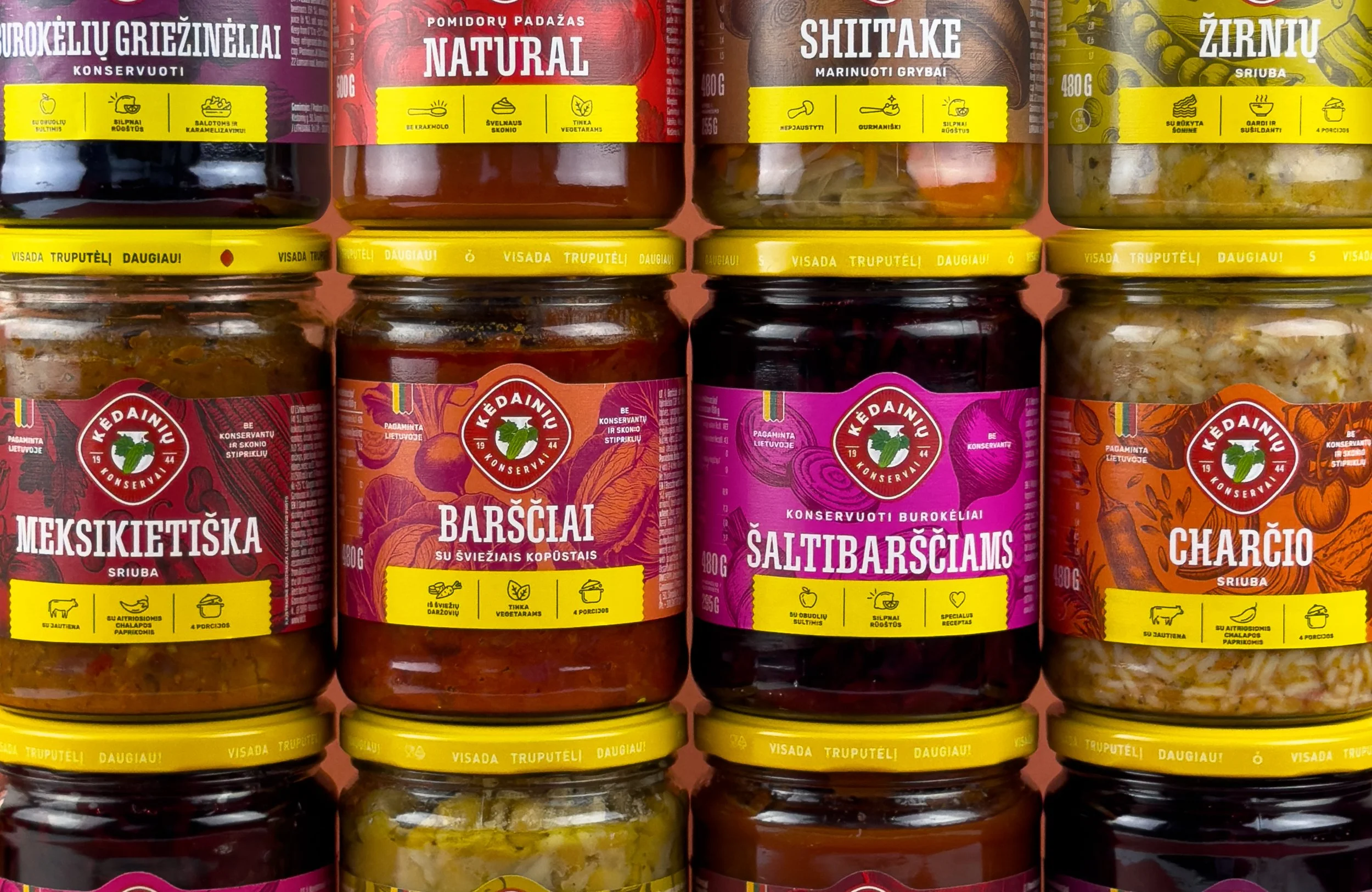
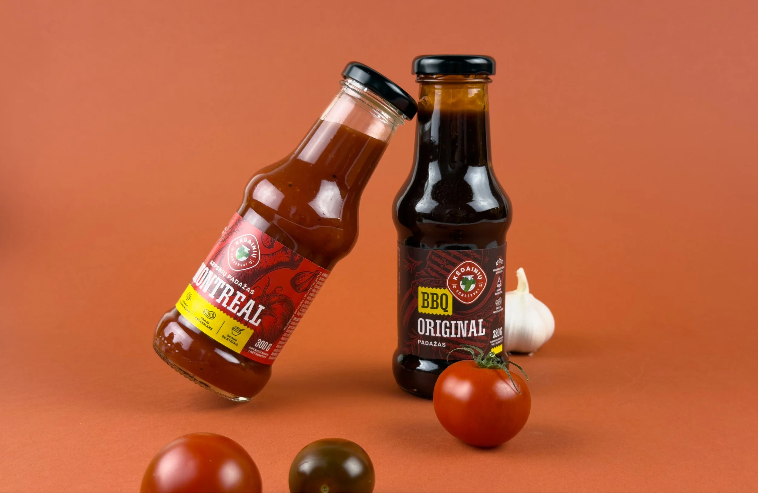
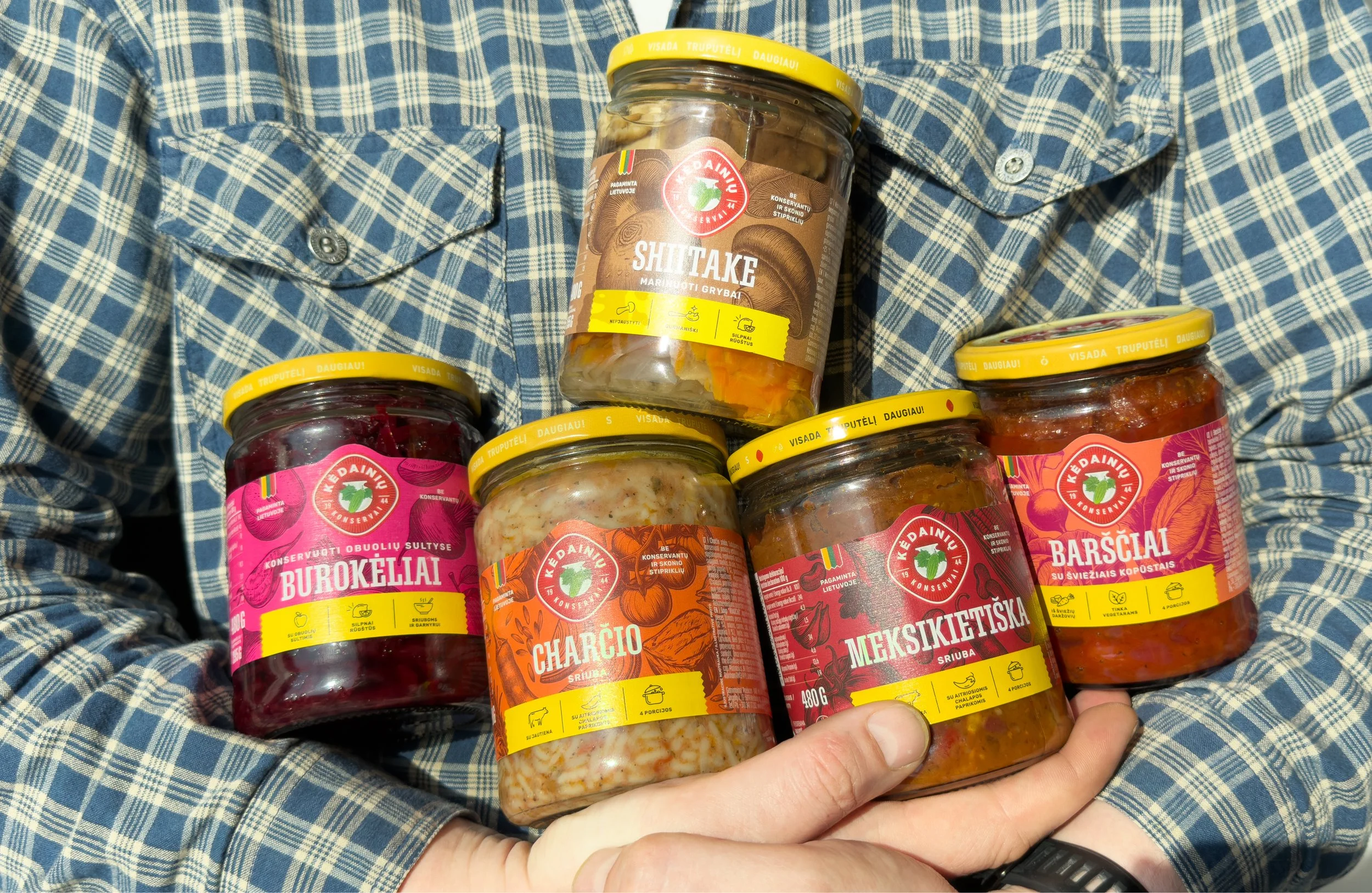
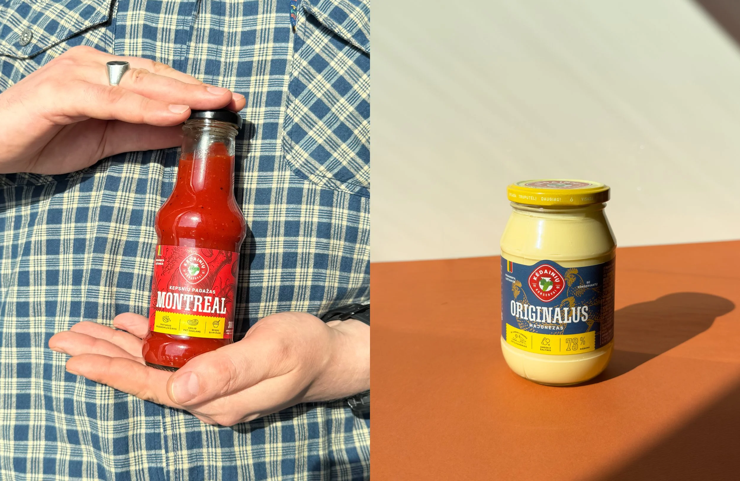
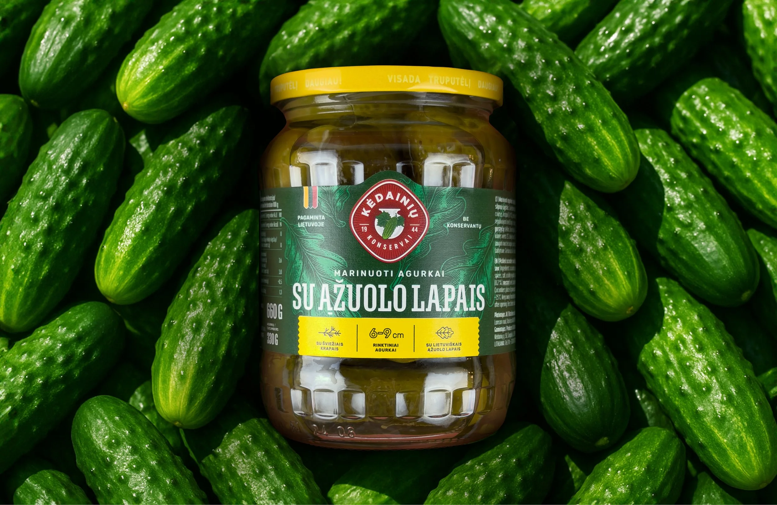
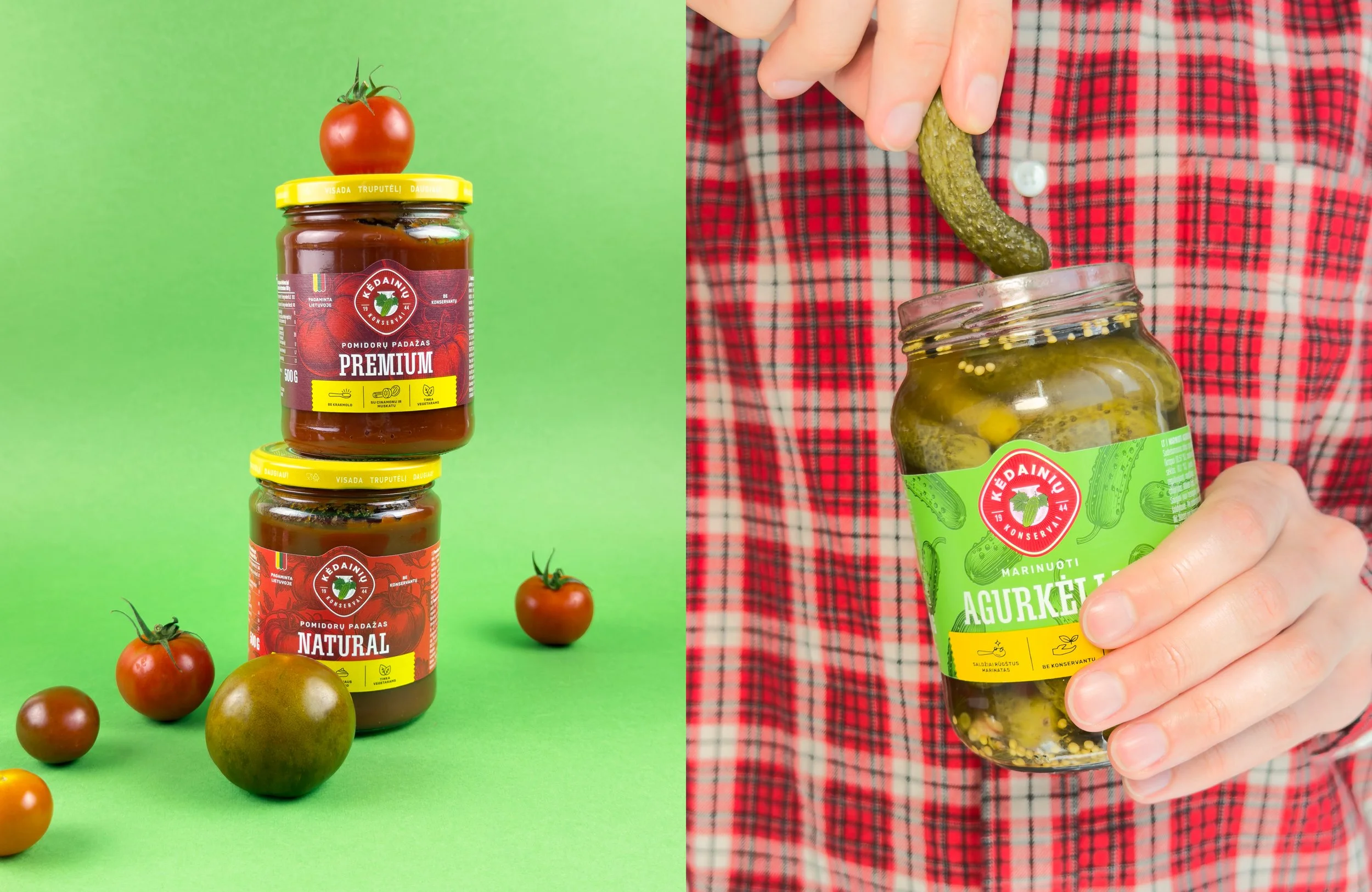
We created a flexible packaging system that gives each product its own visual identity while keeping the range cohesive. Unique background colours were introduced for individual products, helping them stand out on shelf and making flavour differentiation more immediate. Since the product itself is visible through the jar, we moved away from traditional food photography and introduced custom illustrations. Bold and unexpected colour combinations communicate ingredients and flavour while creating a more distinctive visual language. Modern, bold typography gives the product names greater visibility, while a distinctive yellow serrated strip creates a consistent branded element for product benefits and key features.Together, these elements create a structured system that can work across the full product range while strengthening both shelf presence and brand recognition
Illustration
Packaging Design
Packaging System
What’s Golden?
The new system brings clarity and character to a broad product range without losing the recognisability of the KKF brand. Distinctive colours, custom illustrations and stronger typography make each product easier to identify while creating a consistent family across the shelf.
The result is a bold, flexible and highly recognisable packaging system that gives the products more presence and makes flavour communication immediate.
Credits
Art Direction: Ugnė Akstinaitė
Graphic Design: Tatjana Sokolova
Project manager: Lilė Adomaitė
Great&Golden © 2026