IKIGAI TEA packaging
Task & Challenge
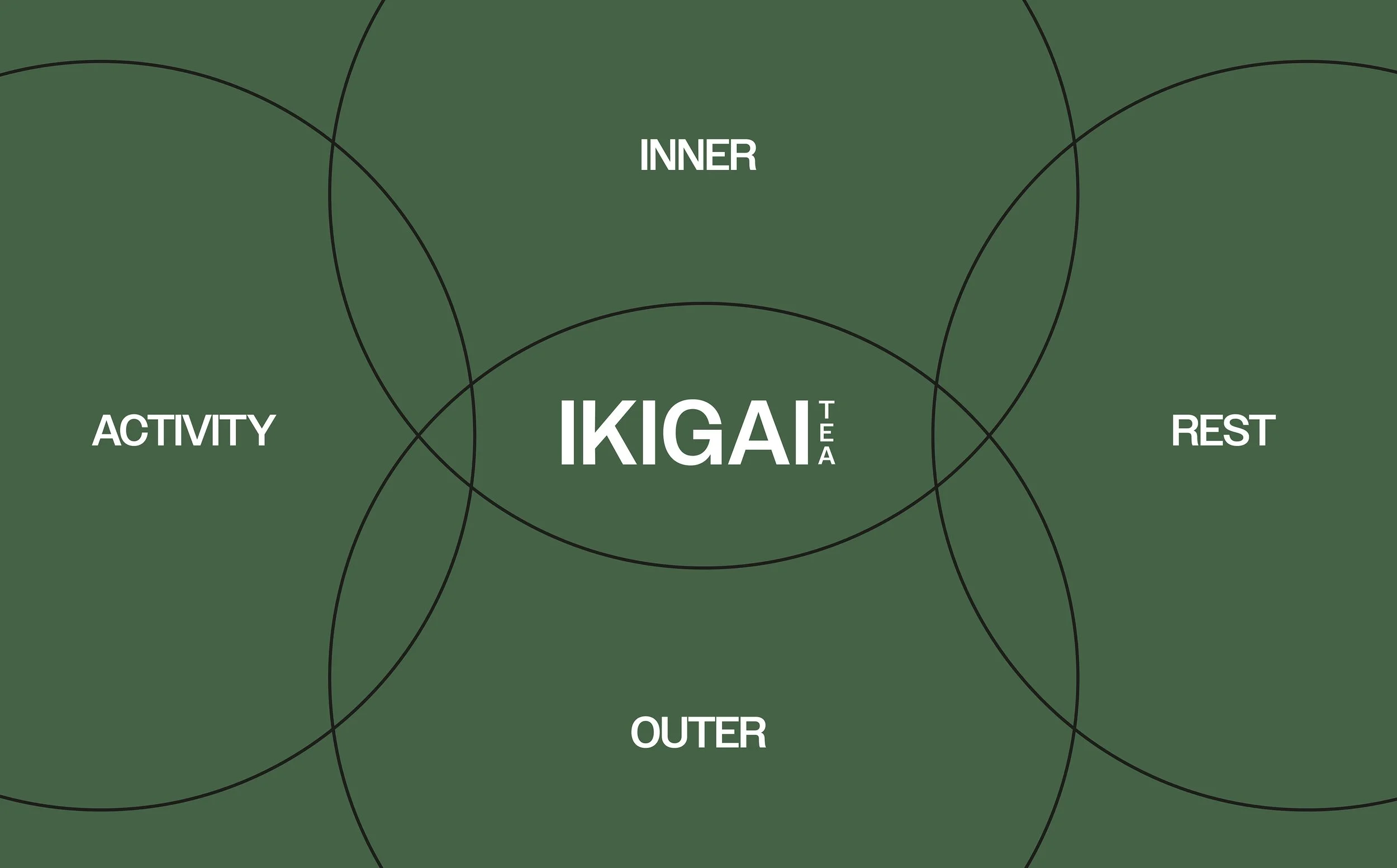
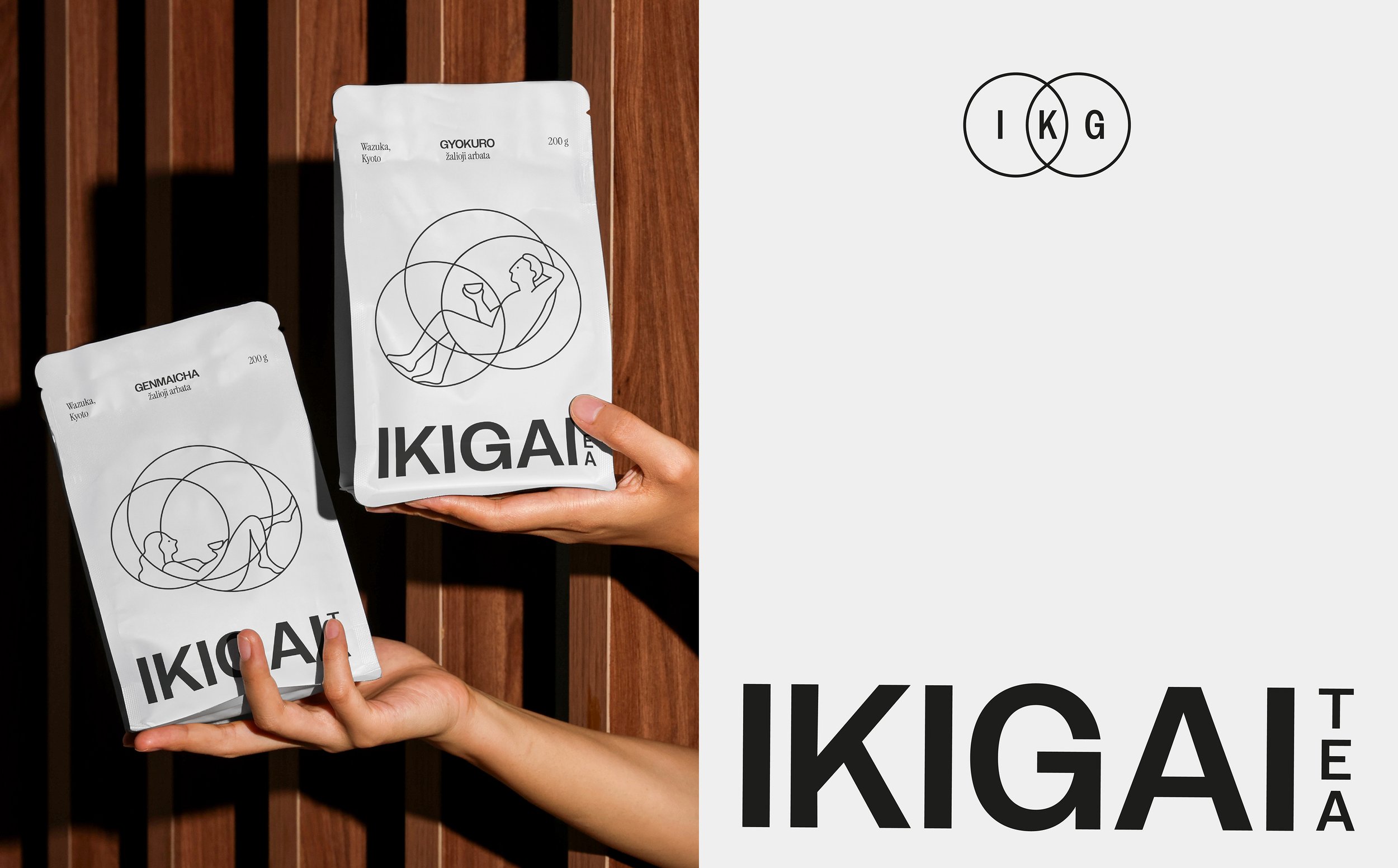
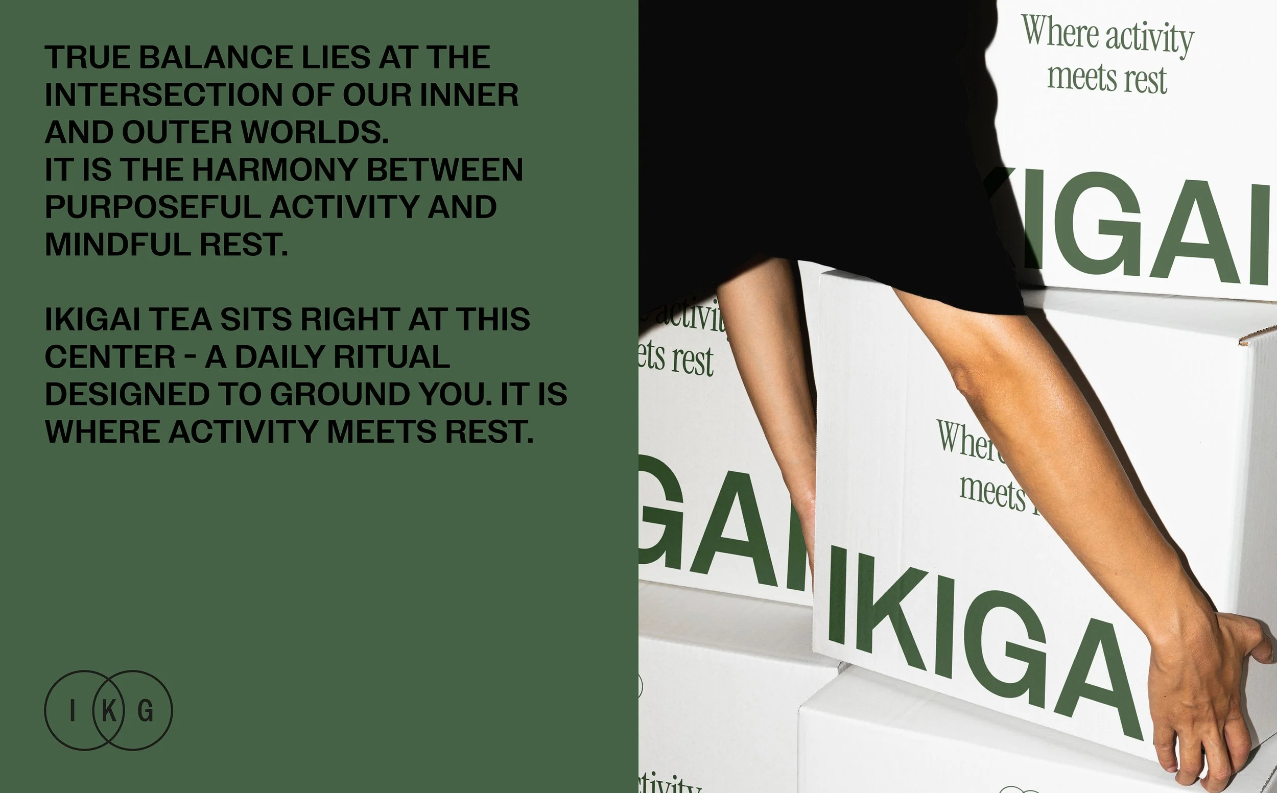
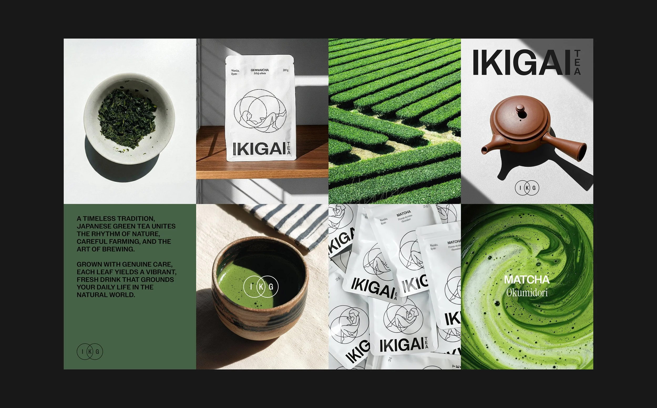
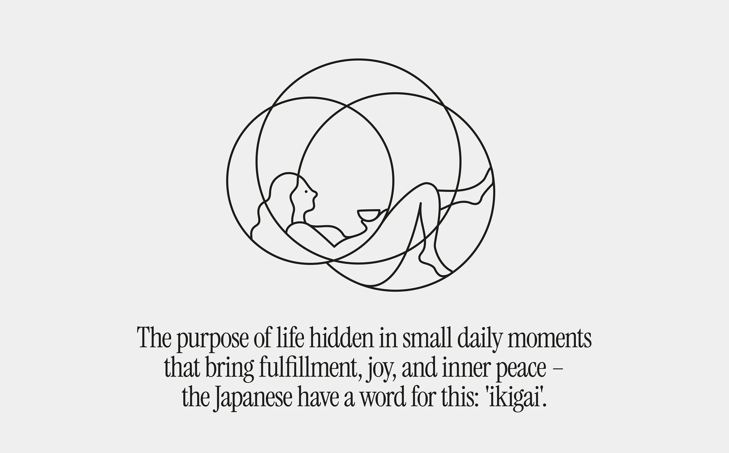
IKIGAI TEA needed a brand and packaging system that would reflect the deeper philosophy behind its name. In Japanese, "Ikigai" represents the intersection of what we love, what the world needs, what we are good at, and what we can be paid for. The goal was to create packaging that would capture the essence of Ikigai — a balance between the inner and outer worlds, between activity and rest - while honoring the slow, mindful ritual of tea drinking.
Solutions
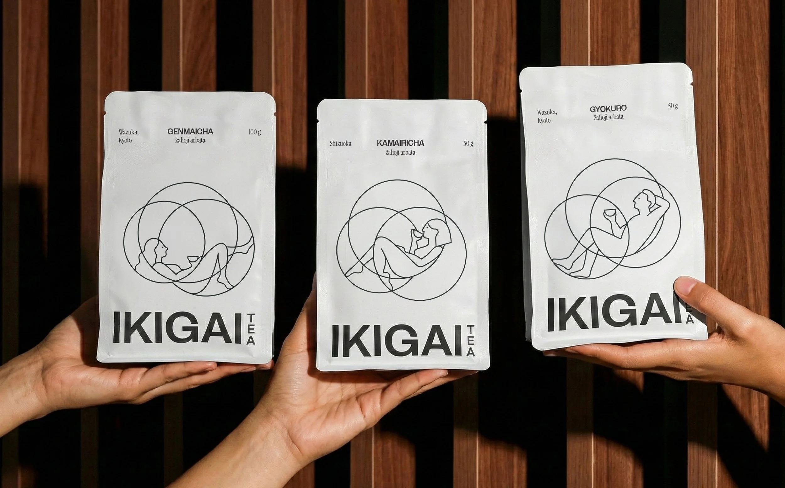
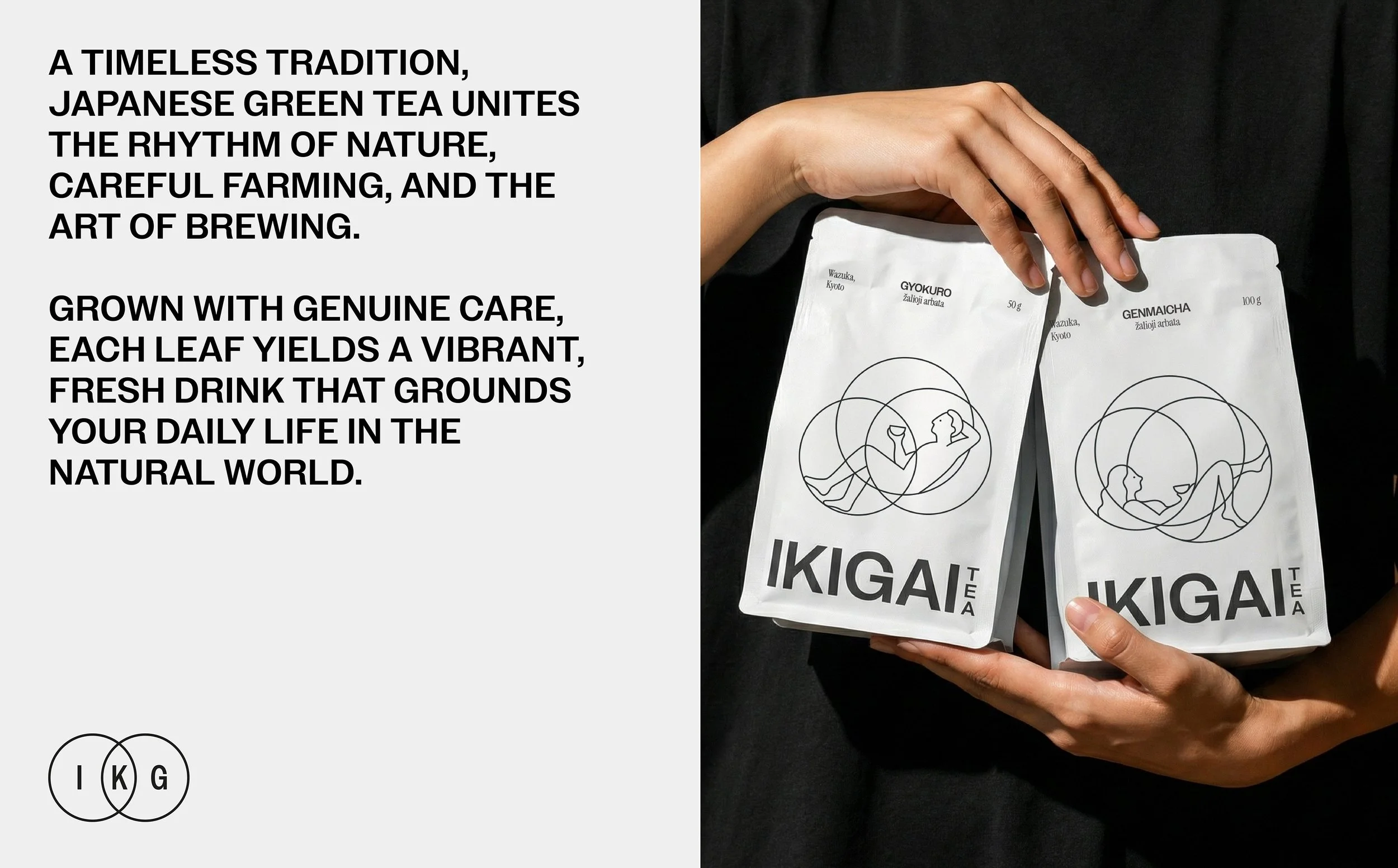
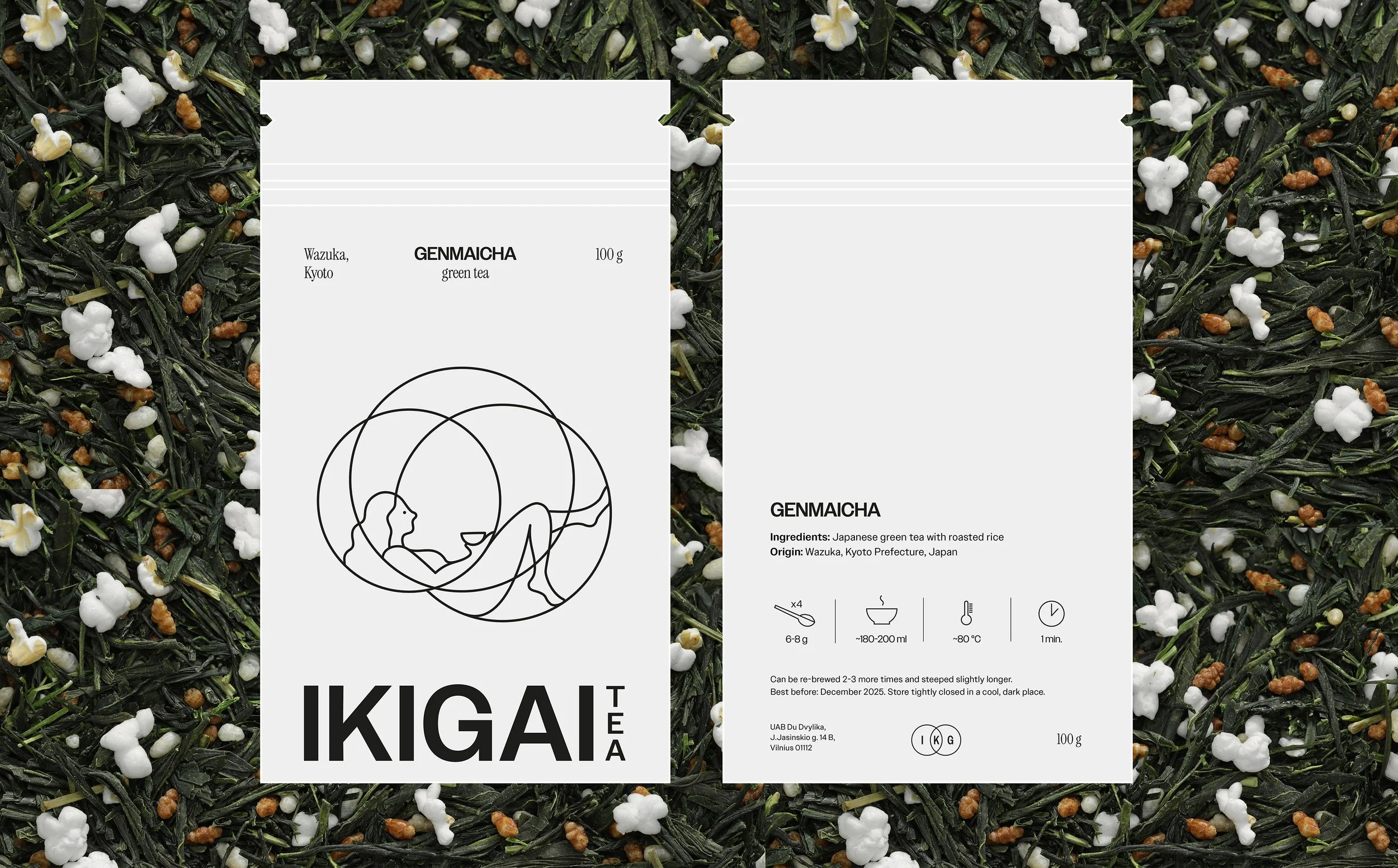
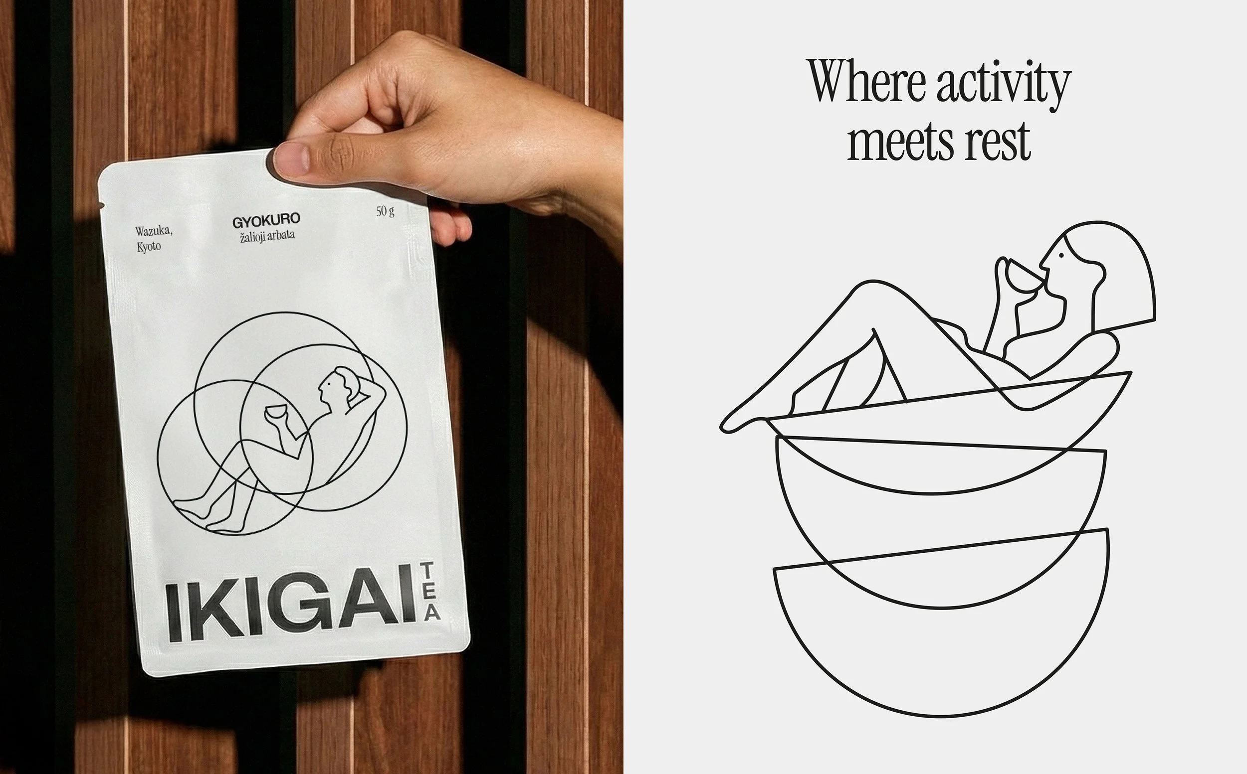
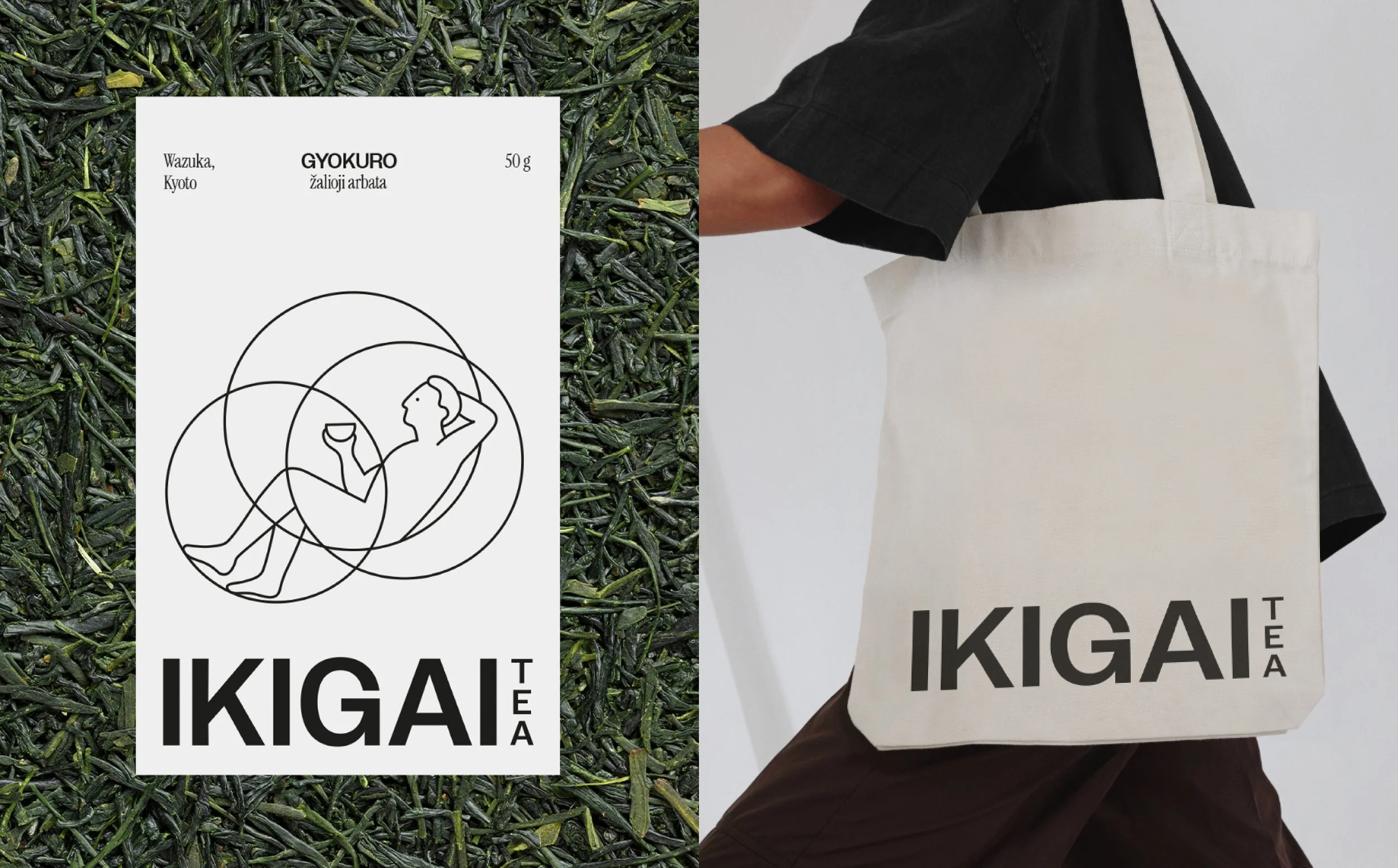
In Japanese, Ikigai represents the intersection of what we love, what the world needs, what we are good at, and what we can be paid for. This intersection is often visualized through overlapping circles, with the perfect Ikigai point at the center. Tea, in its own way, offers that same "sweet spot" - a balance between the inner and outer worlds, between activity and rest, a moment of peace in a busy world. To reflect this idea, we created a packaging system with illustration at its heart. Each illustration features a relaxed figure, holding a cup of tea, resting at the center, the intersection of overlapping circles.
Research
Creative Direction
Logotype
Branding
Merchandise
Packaging
Packaging system
Label
What’s Golden?
The translation of this deep philosophy into a clear visual system results in more than just packaging - it delivers a mindful experience. Every illustration, from the overlapping circles to the central relaxed figure, harmonizes inner balance with a daily ritual, perfectly capturing tea as your personal moment of peace.
Credits
Art Direction & Graphic Design: Julija Stasiulaitė, Aušrinė Alasauskaitė
Illustration: Laura Jagėlaitė
Project manager: Lilė Adomaitė
Great&Golden © 2026