OPTI.MIST branding
Task & Challenge
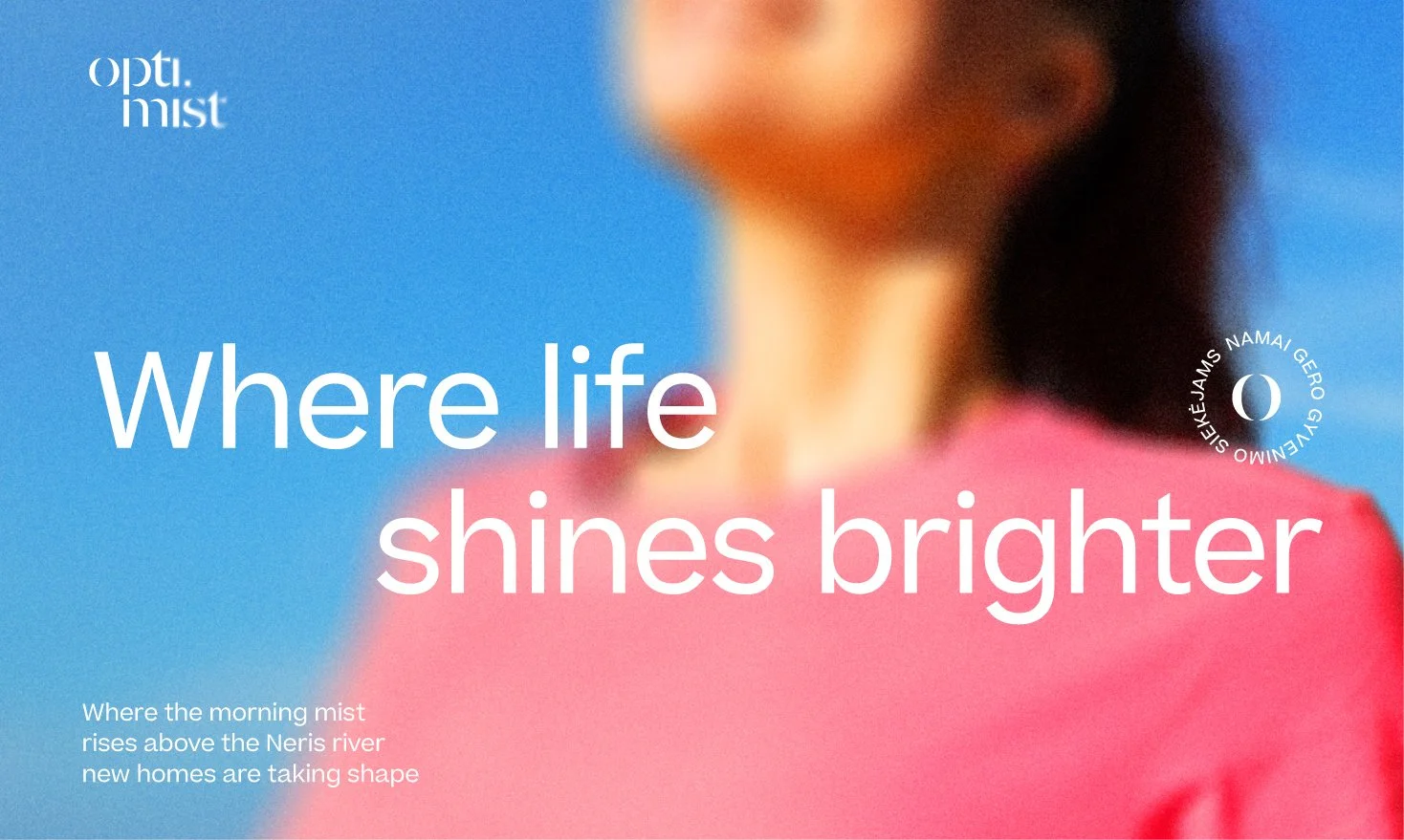
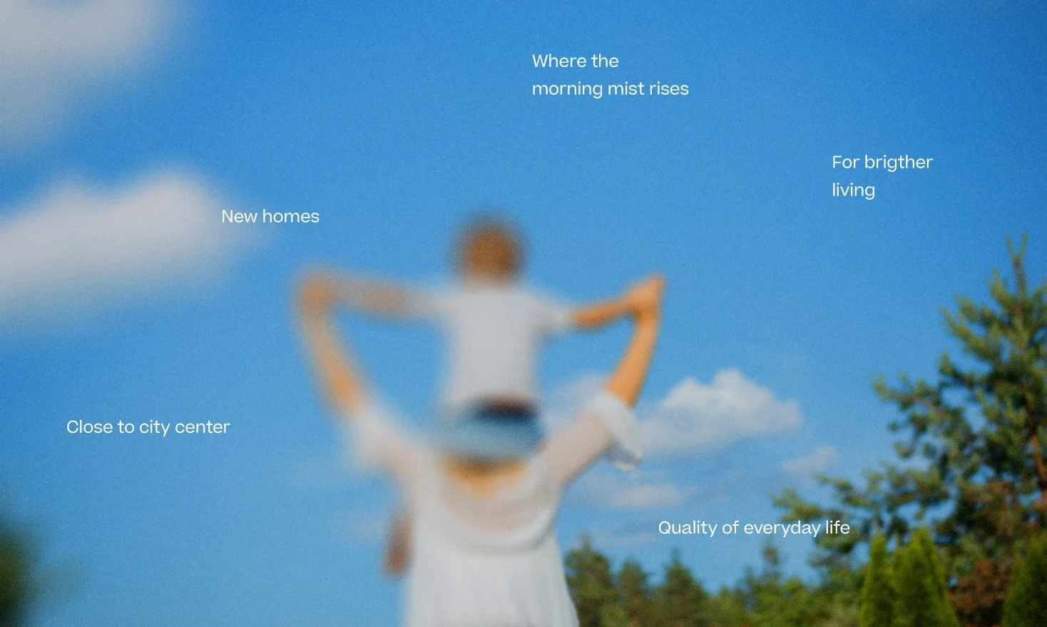
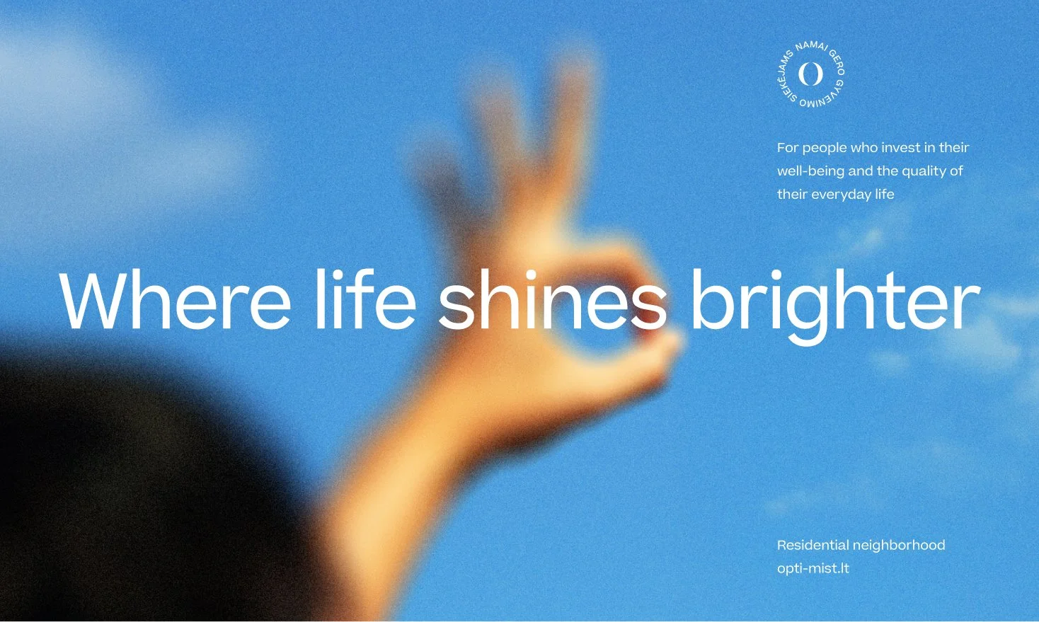
OPTI.MIST is a residential project inspired by the atmosphere of the Neris riverside.The challenge was to create a name and identity that capture a feeling rather than simply describe a place-light, calm, optimistic, and emotionally uplifting. Inspired by the morning mist rising above the river, the brand was designed to communicate clarity, softness, and a brighter way of living.
Solutions
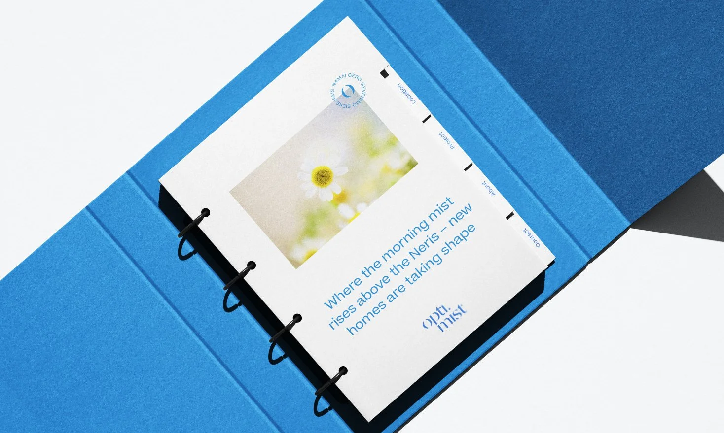
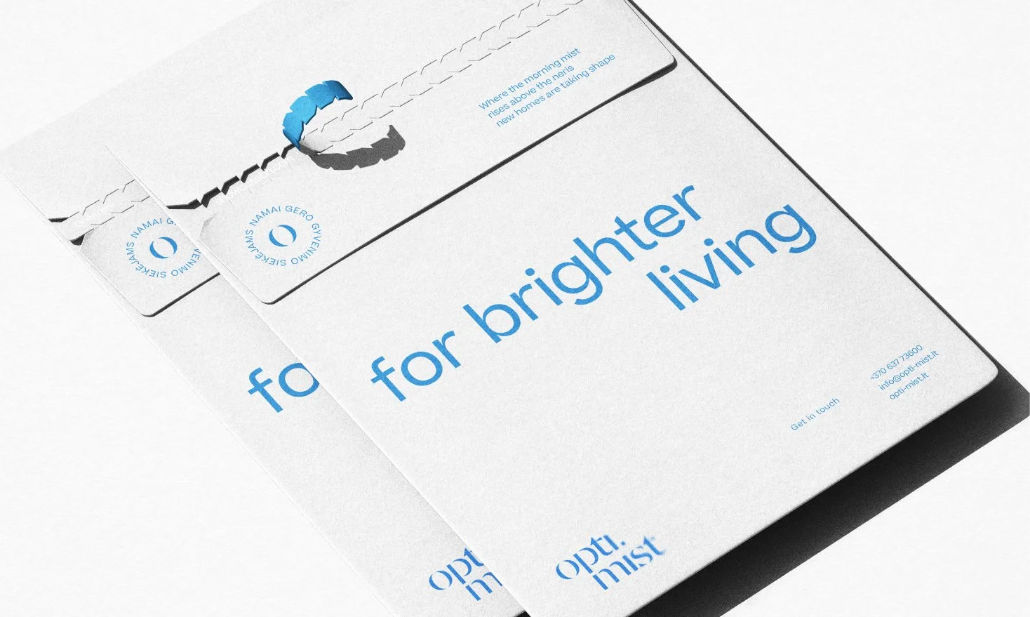
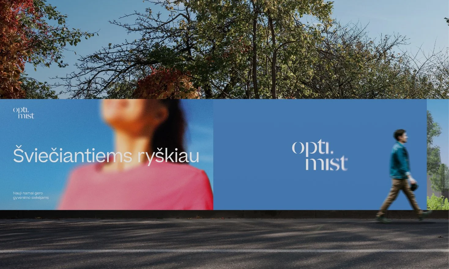
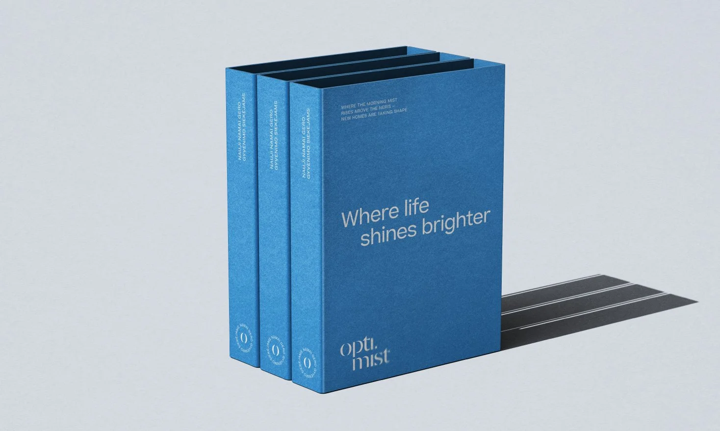
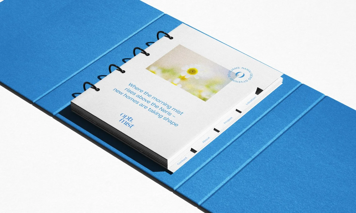
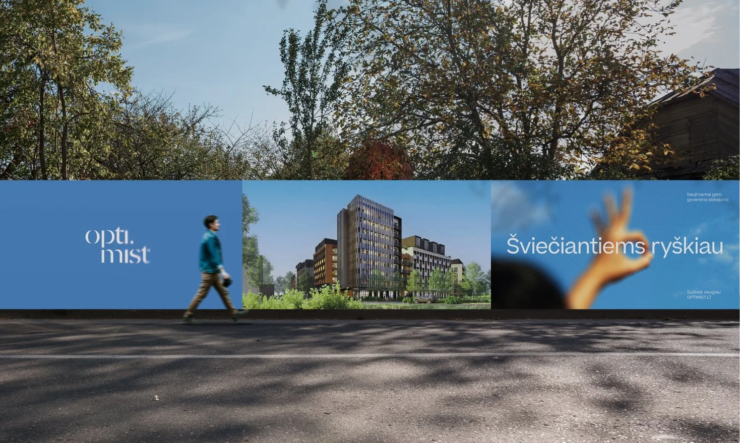
The identity combines minimal typography, soft gradients, and blurred imagery to create a dreamlike visual atmosphere. Light becomes the core element of the system appearing through color, transparency, and open compositions. The name itself merges two ideas: optimism and mist. Together, they shape a brand language that feels airy, contemporary, and emotionally warm. Across print, outdoor, and digital applications, the system remains clean and recognizable while maintaining a soft, almost cinematic mood.
Naming
Visual Identity
Branding
What’s Golden?
Where life shines brighter. The identity is built around emotion rather than architecture focusing on atmosphere, everyday well-being, and the feeling of home. Instead of speaking through technical real estate language, the brand creates a quieter and more human connection. A visual system inspired by mist, light, and optimism designed for people seeking clarity, balance, and quality of everyday life.
Credits
Agency: Great & Golden
Strategy: Toma Stasiukaitytė
Art direction & design: Julija Stasiulaitė
Project Manager: Eglė Paliulienė
Great&Golden © 2025