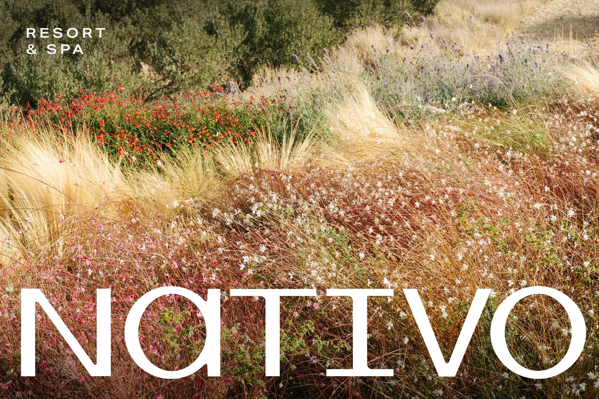
NATIVO branding
Task & Challenge
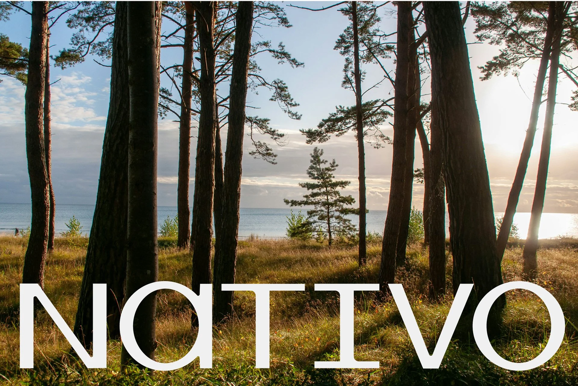
Nativo is a resort and spa rooted in the landscape of the Baltic coast. The challenge was to create an identity that reflects the calm, restorative character of the place while staying contemporary and distinctive. Inspired by endemic coastal plant species, the visual system translates local nature into a refined and minimal brand language one that feels both organic and structured.
Solutions
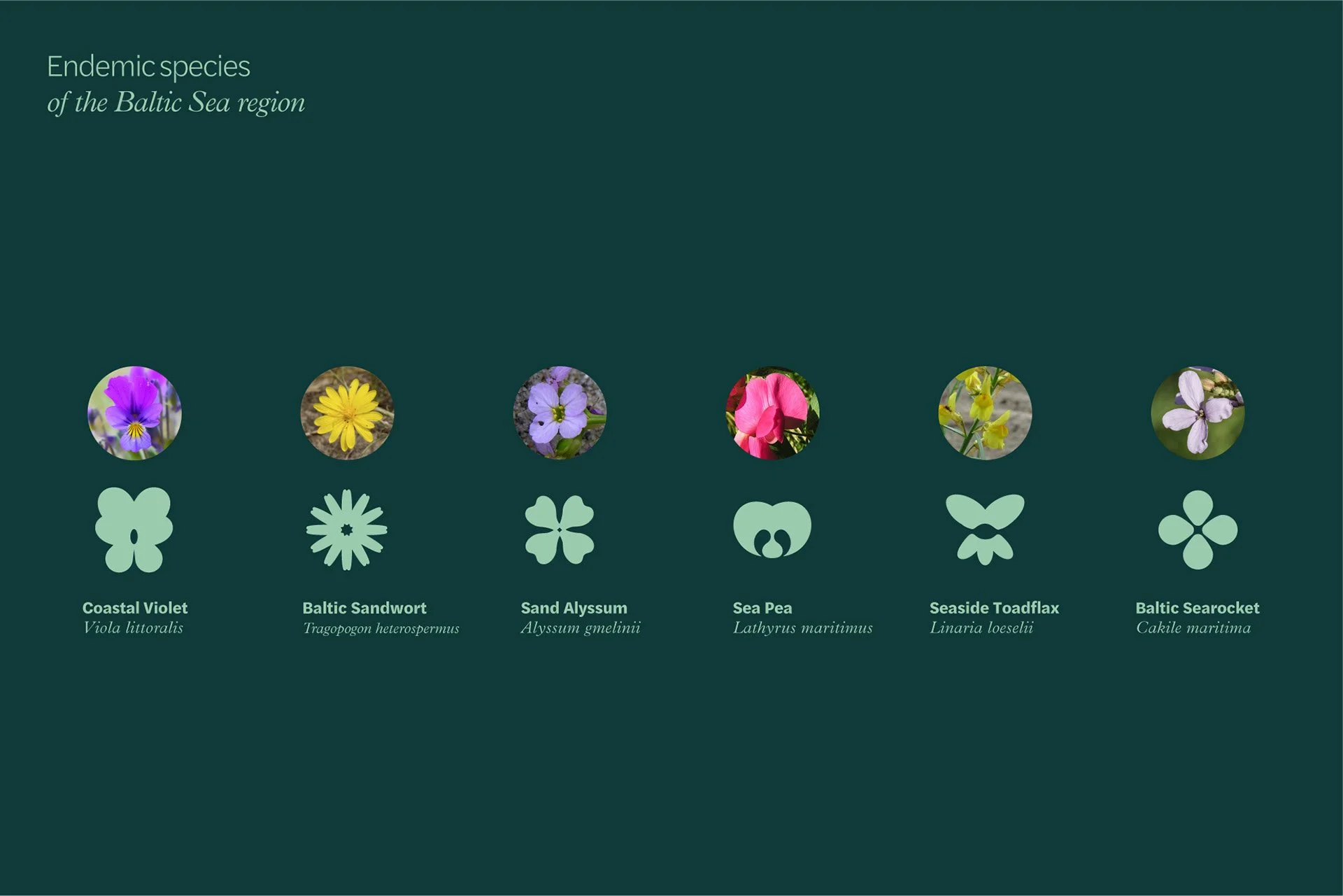
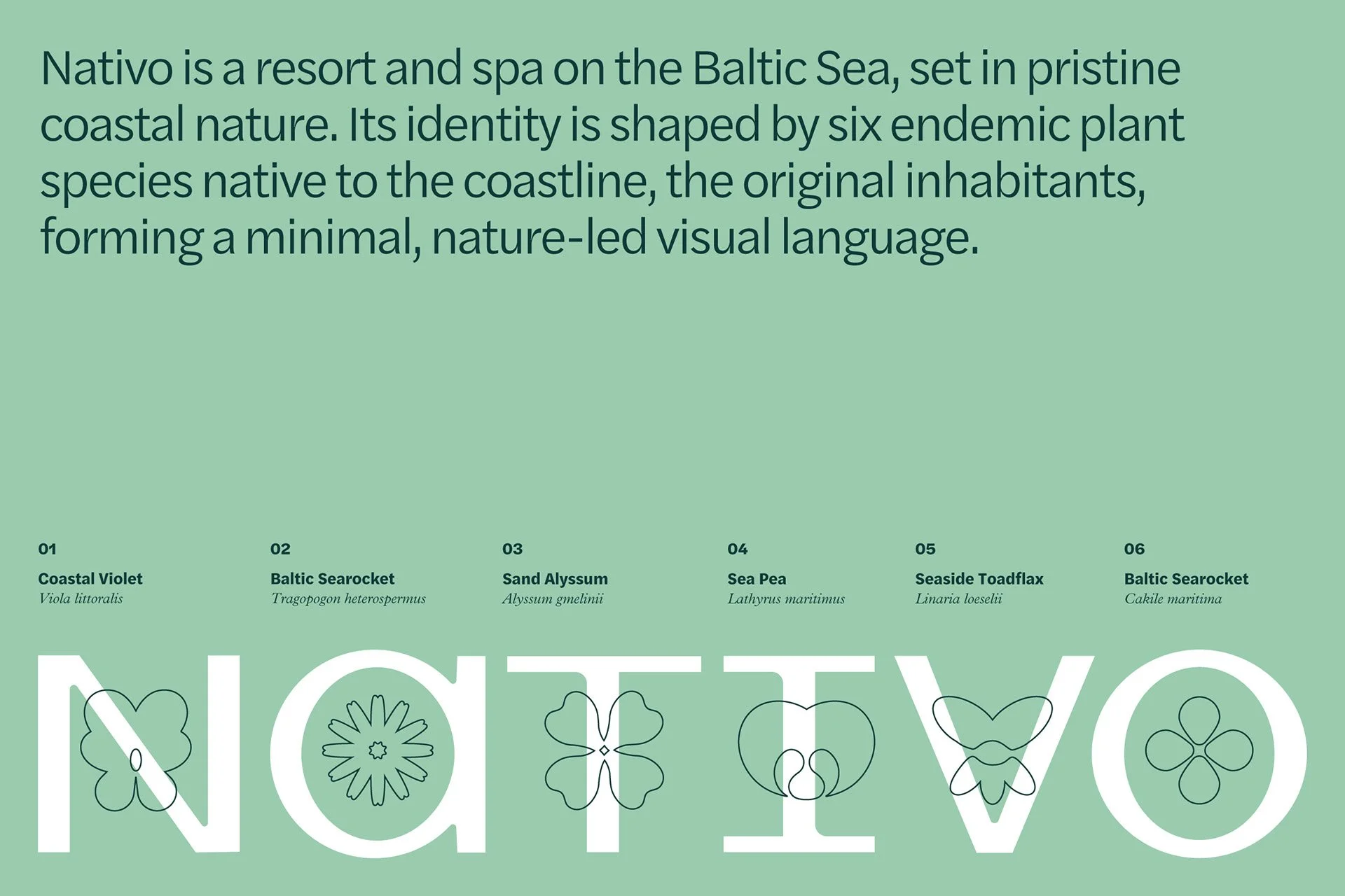
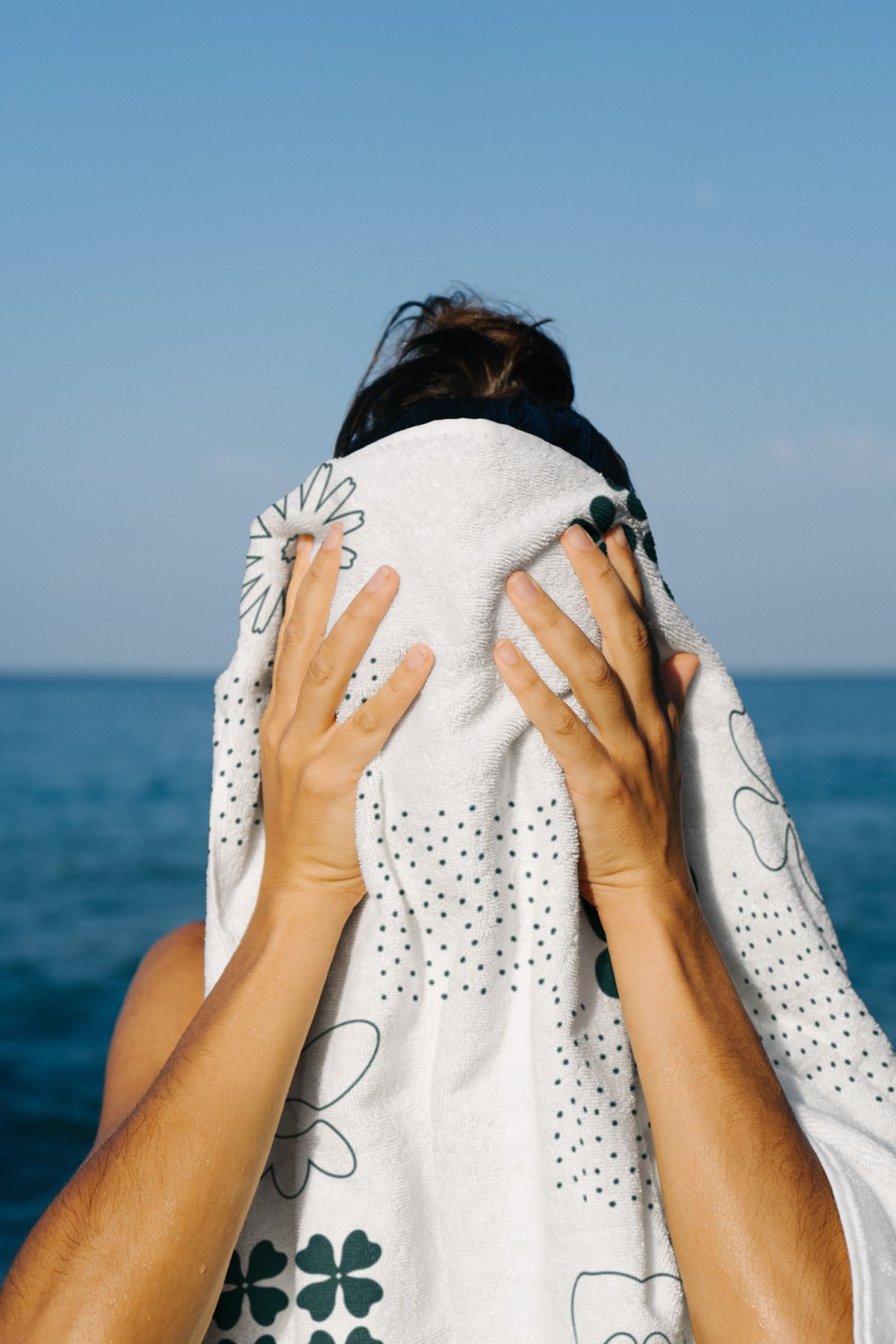
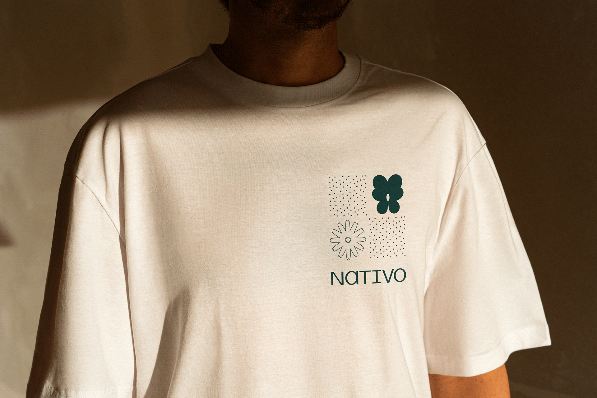
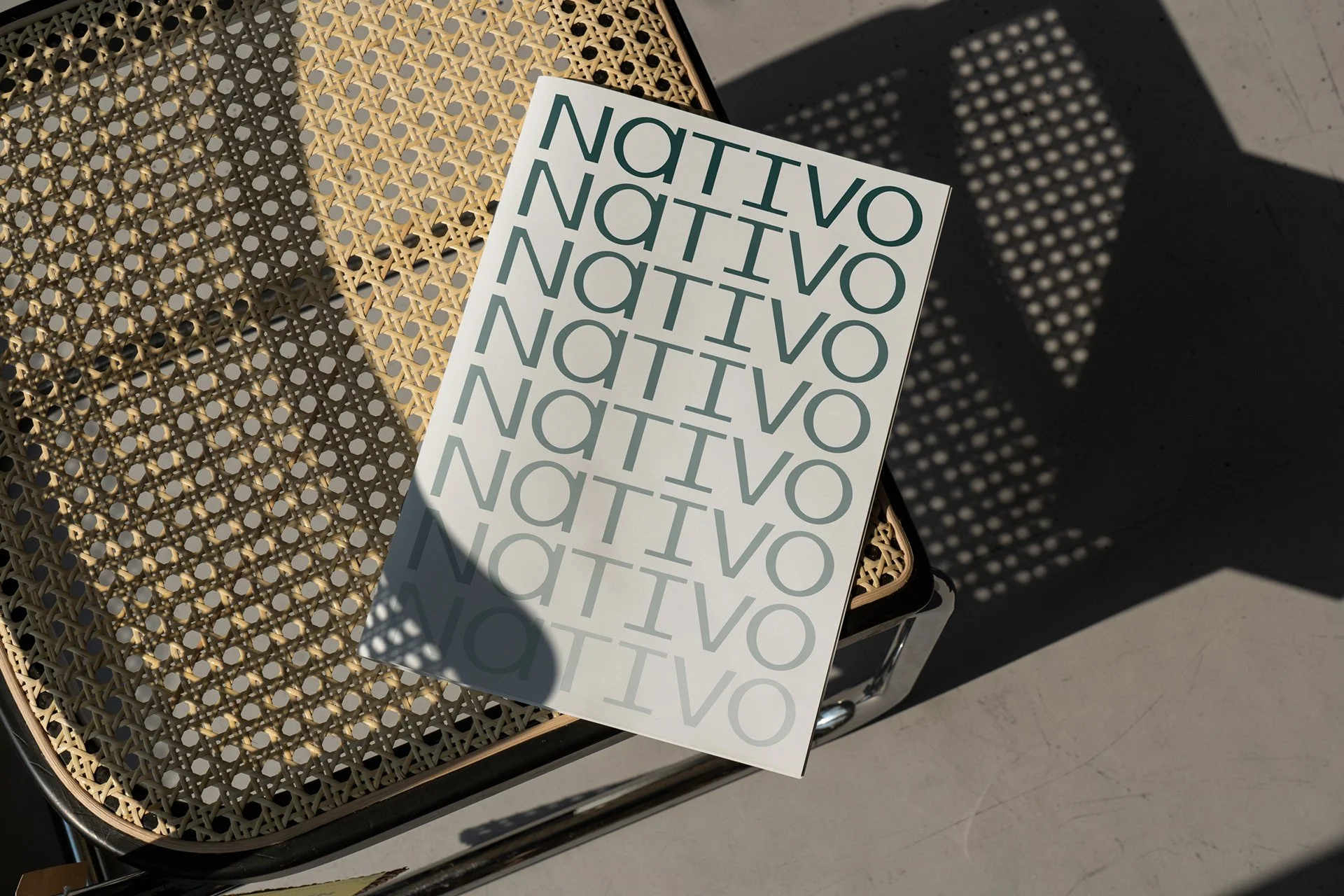
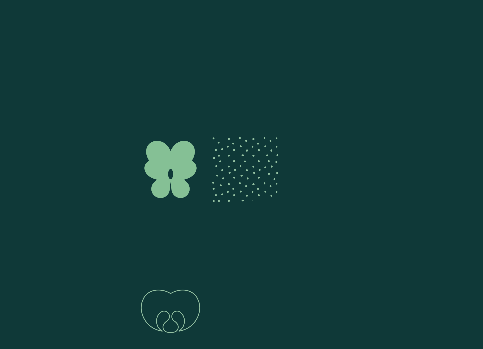
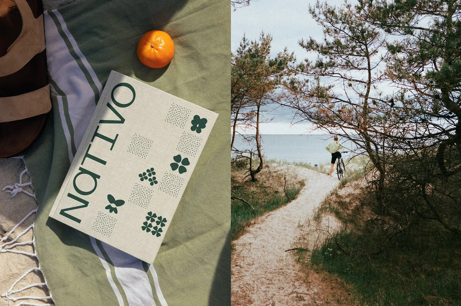
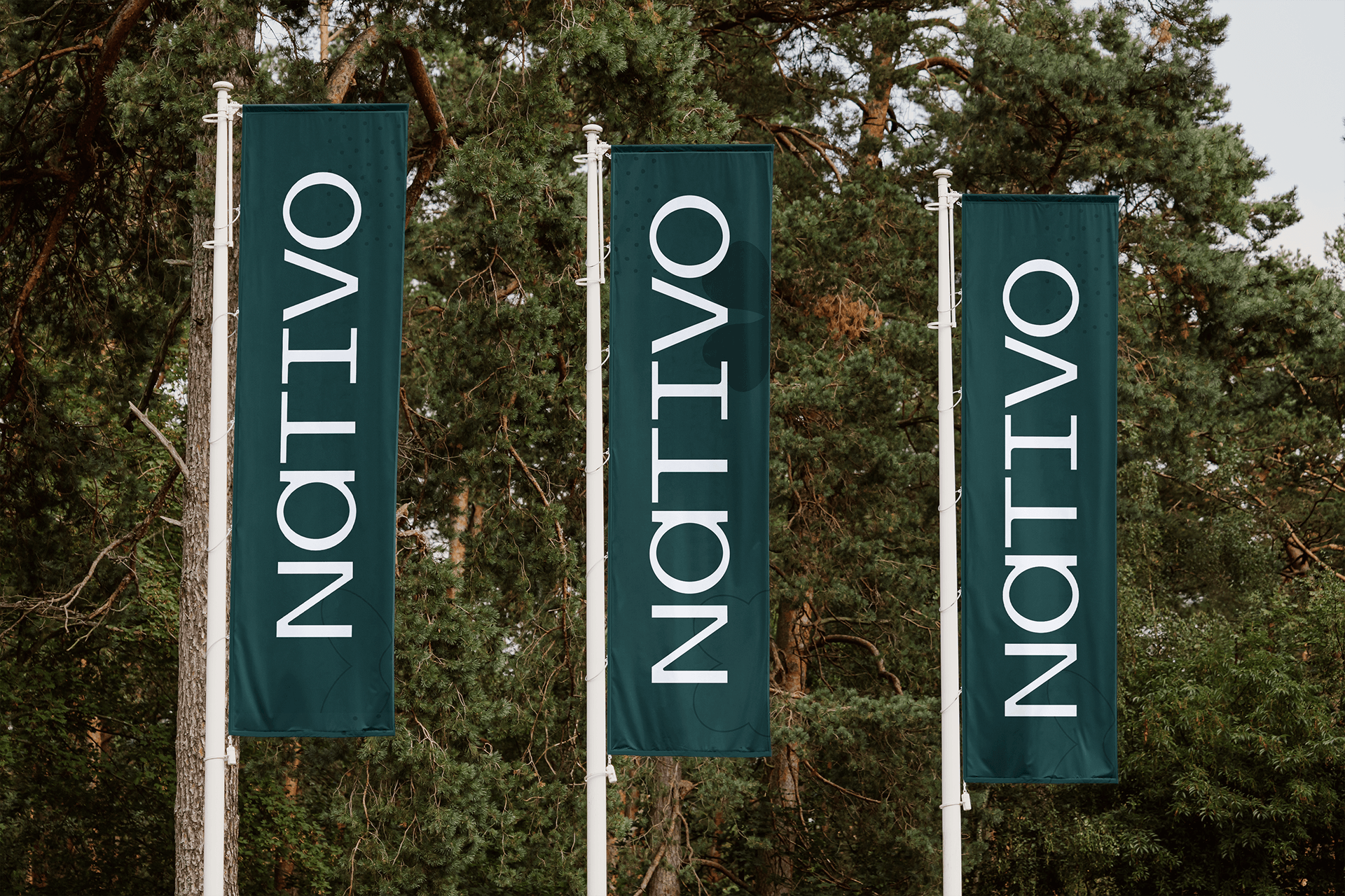
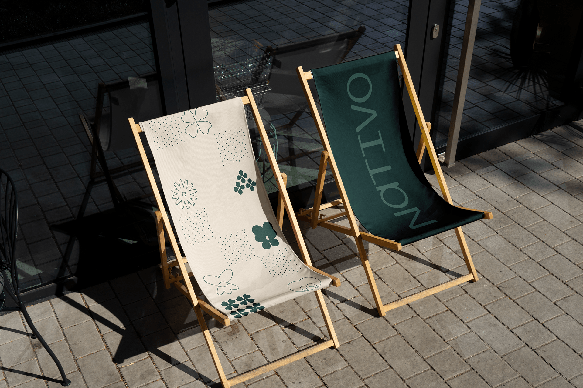
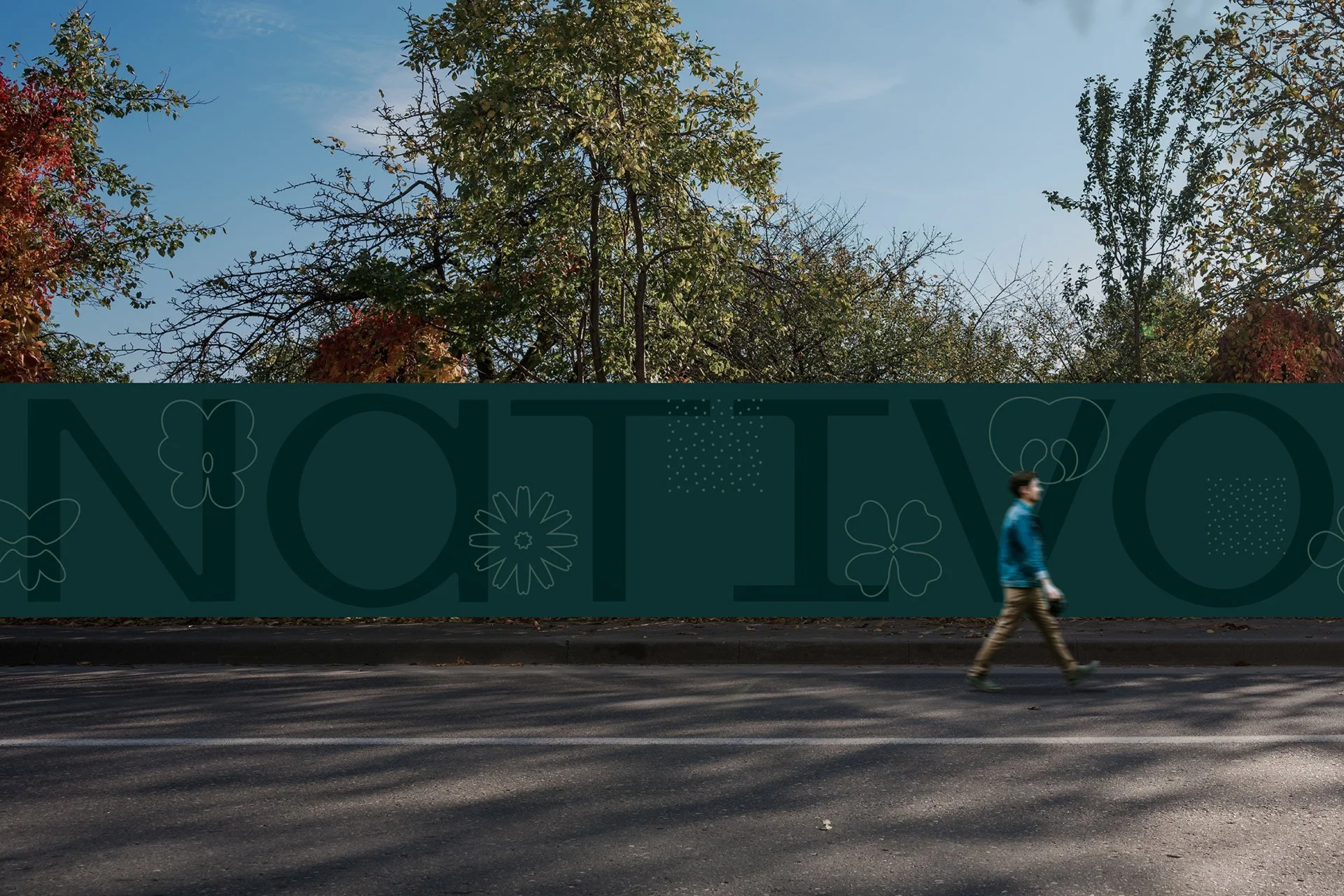
The identity is built around six native coastal plants, transformed into simplified graphic symbols. These forms create a flexible visual system that extends across print, textiles, signage, and spatial applications. Soft natural tones, open compositions, and restrained typography reinforce a sense of calm, balance, and connection to place. The result is an identity that feels quiet yet recognizable designed to blend into the landscape rather than compete with it.
Visual Identity
Branding
What’s Golden?
Nature, reduced to its essence. The identity captures the atmosphere of the Baltic coastline through simple forms, soft rhythms, and tactile applications. Rather than relying on decorative wellness clichés, the system creates a more grounded experience calm, contemporary, and deeply connected to its environment.
Nativo becomes not just a destination, but a visual extension of the landscape itself.
Credits
Agency: Great & Golden
Strategy: Toma Stasiukaitytė
Art direction & design: Julija Stasiulaitė
Project Manager: Daumantas Kairys
Great&Golden © 2025