
Lithuanian Riflemen’s Union
Task & Challenge
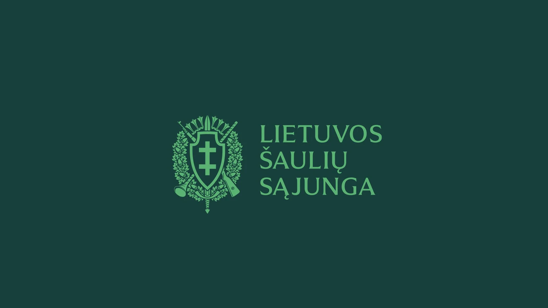
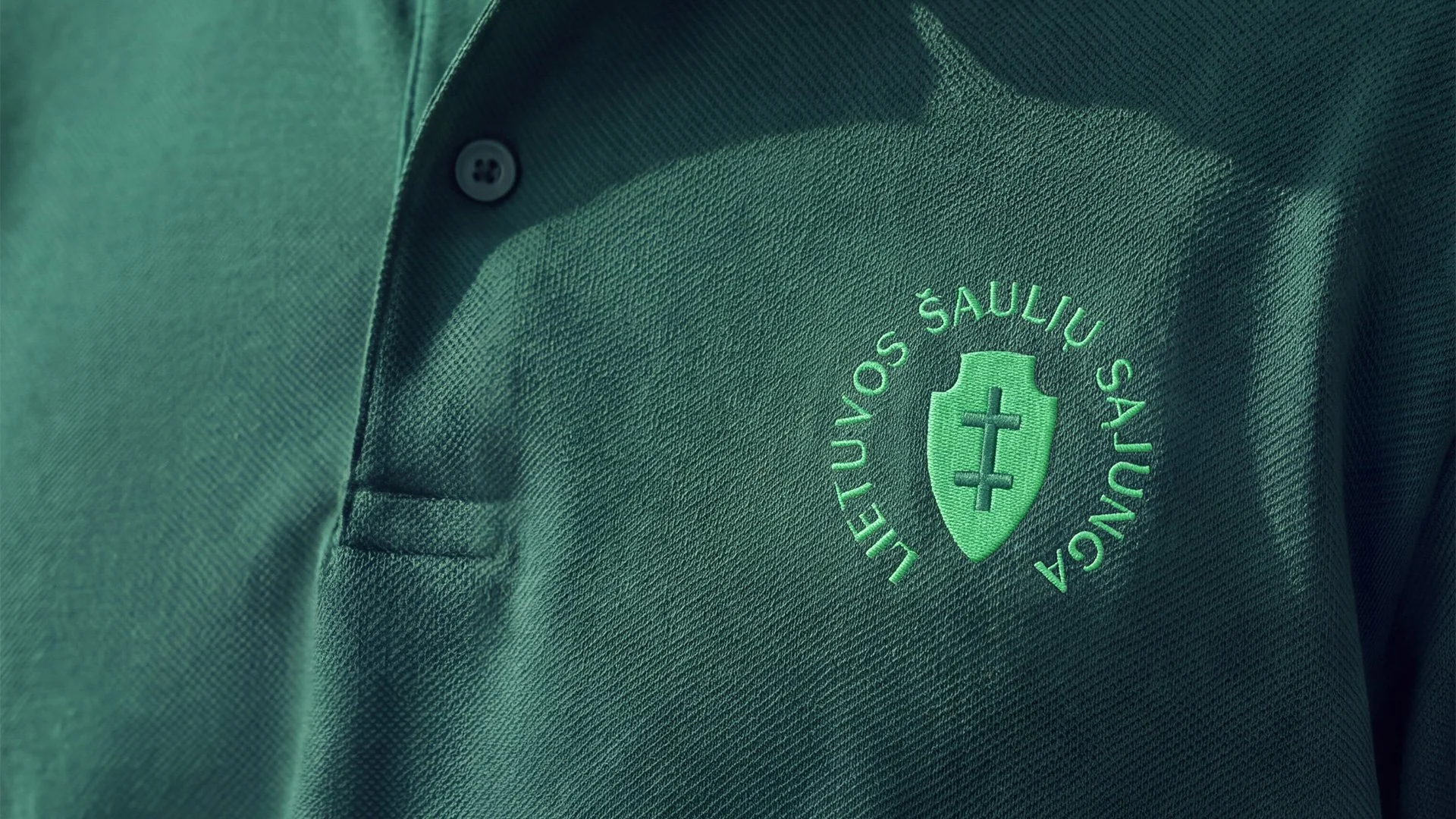
Lithuanian Riflemen’s Union (Lietuvos šaulių sąjunga) approached us to renew its visual identity. The organisation carries a deep historical heritage and one of Lithuania’s oldest heraldic symbols: the Vytis Cross on a shield. Our challenge was to preserve its history and authority while making the identity feel contemporary, open and approachable. At the same time, we needed to create a unified visual language for the Union’s headquarters and regional units, allowing each unit to express its own identity while remaining part of the larger organisation.
Solutions
The identity is built around the idea of duality, reflecting the spirit of the Union: tradition and modernity, hierarchy and community, personal growth and service to the nation.
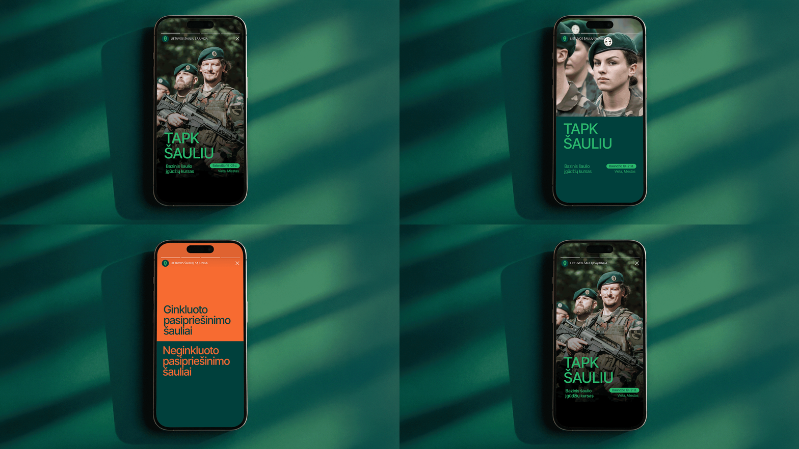
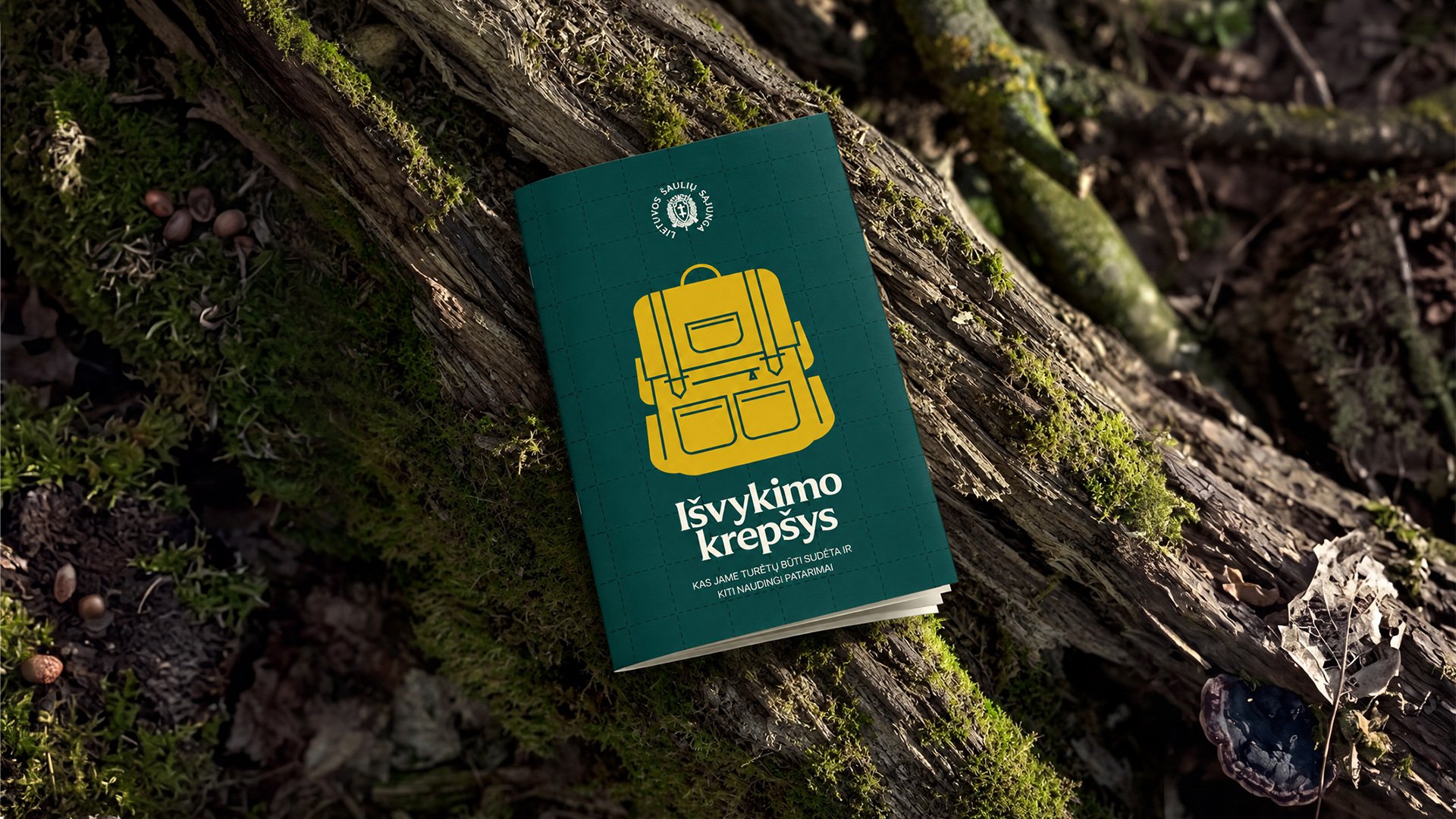
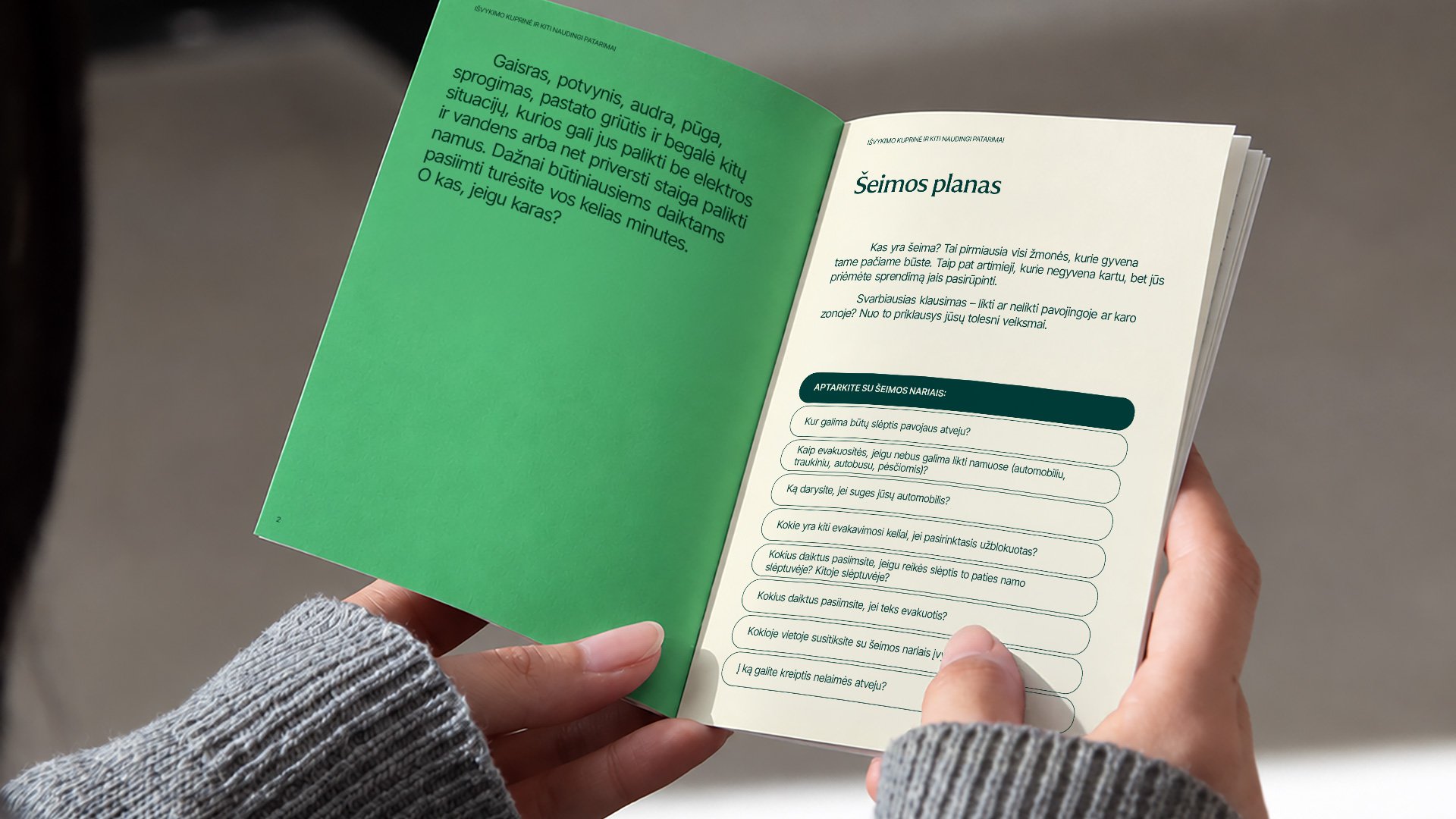
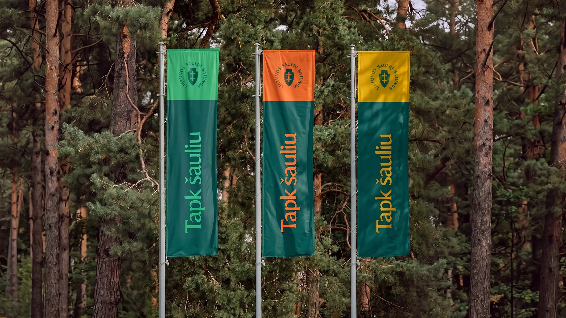
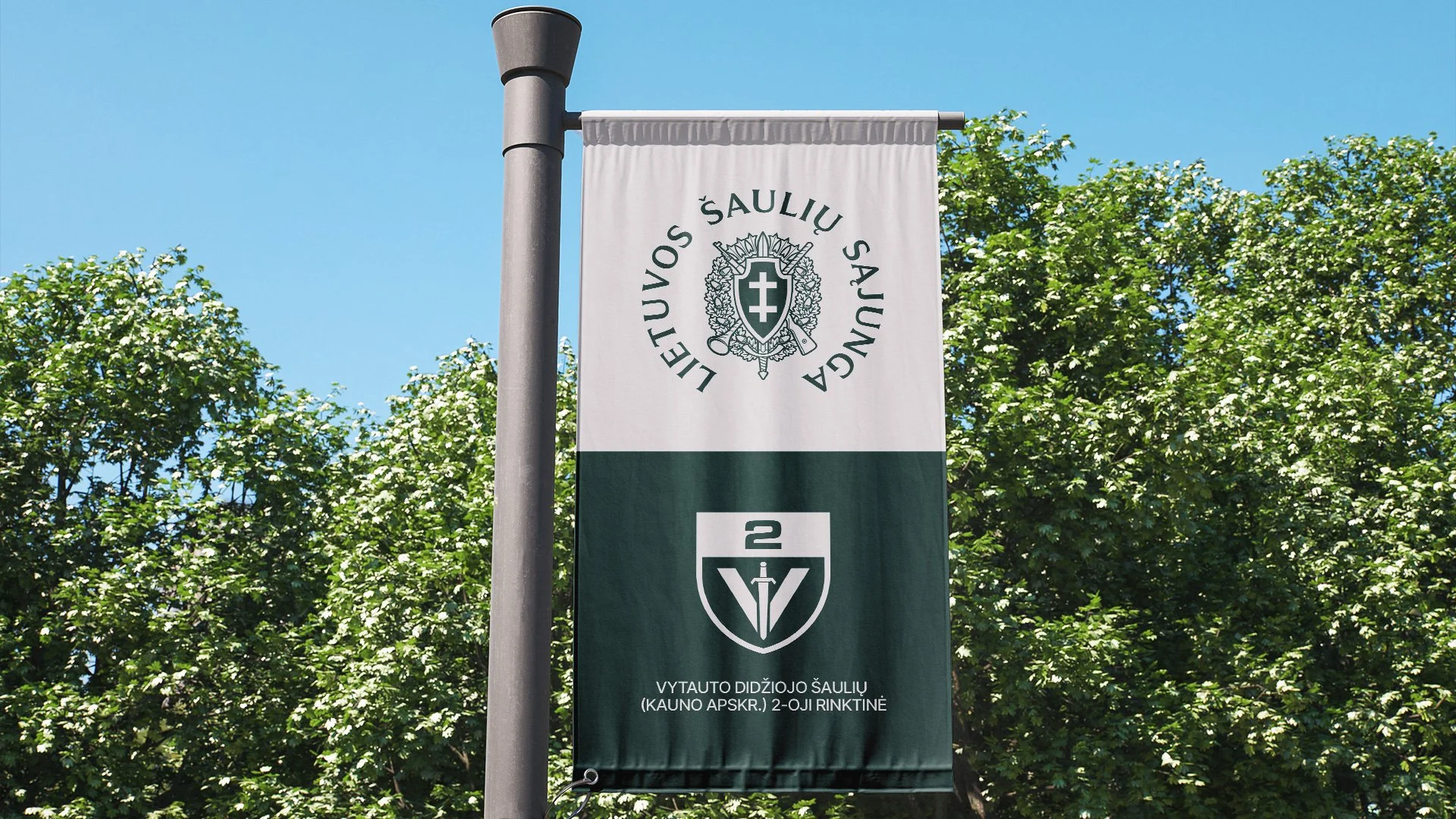
We translated this idea into a visual system based on colour contrast. Deep pine green represents tradition and stability, paired with a brighter colour — fresh green, mustard yellow or copper orange — to express modernity and change. Together, these contrasting colours became a distinctive element of the identity.
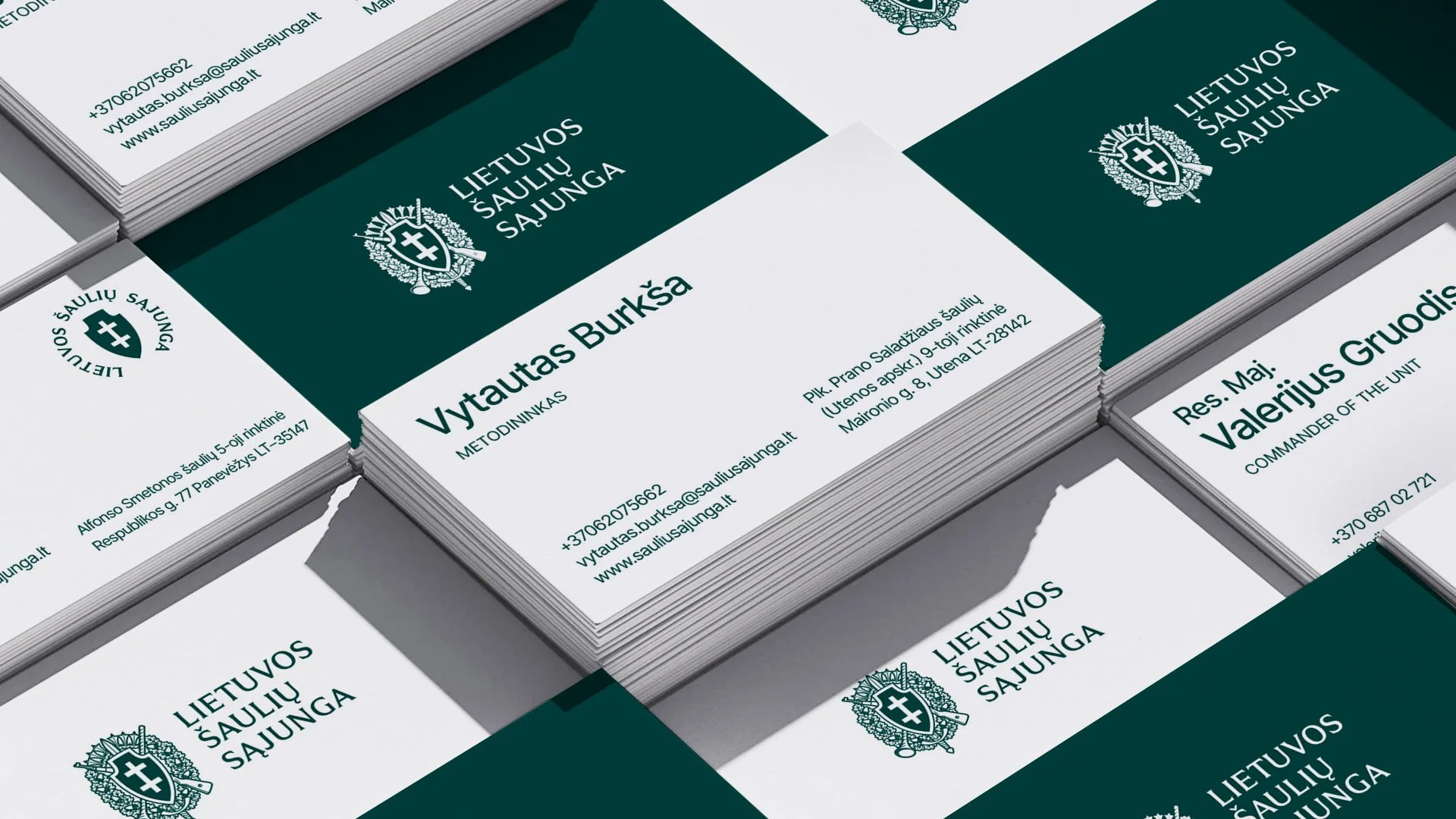
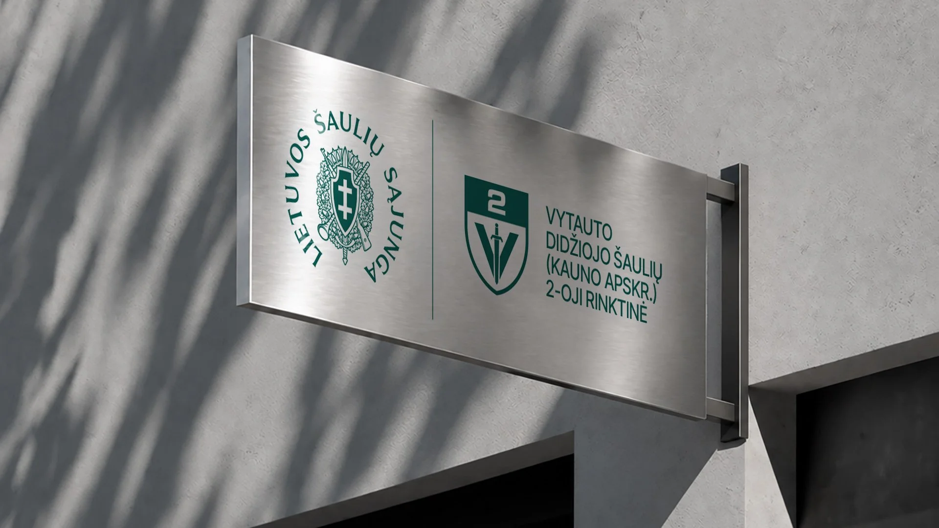
A flexible grid brings the entire system together. A two colour strip accommodates the logos of the Union and its regional units, defines the position of the logo block and functions as a graphic element in its own right. The heraldic logo comes in several versions, from the full ceremonial emblem to simplified shields and symbols, ensuring legibility across formats of all sizes from official documents to caps, badges and digital favicons.
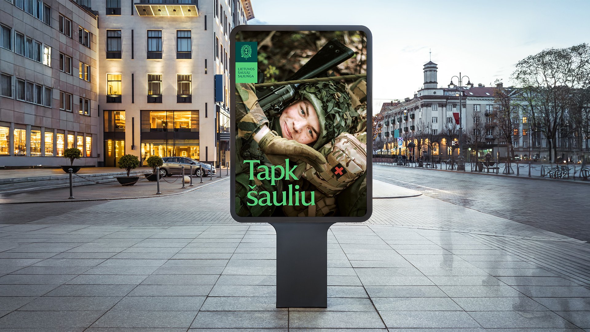
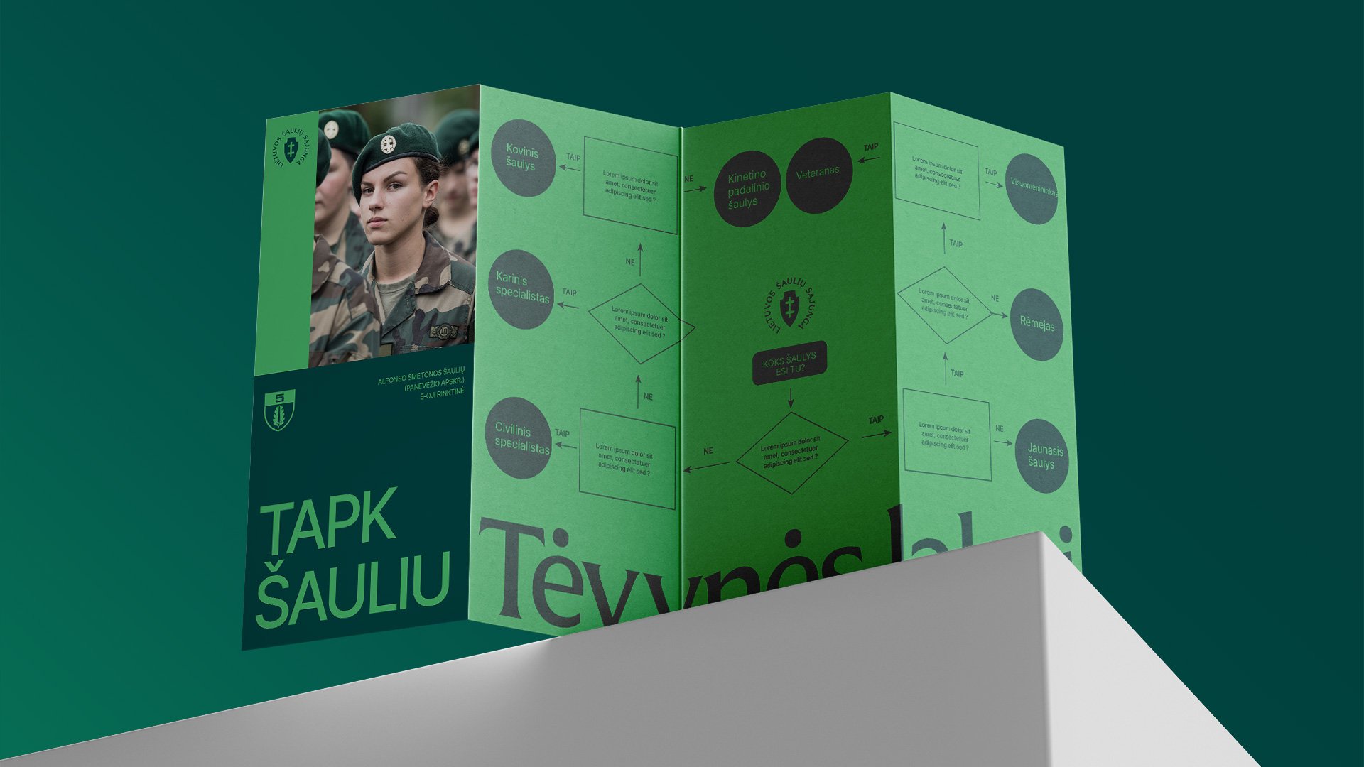
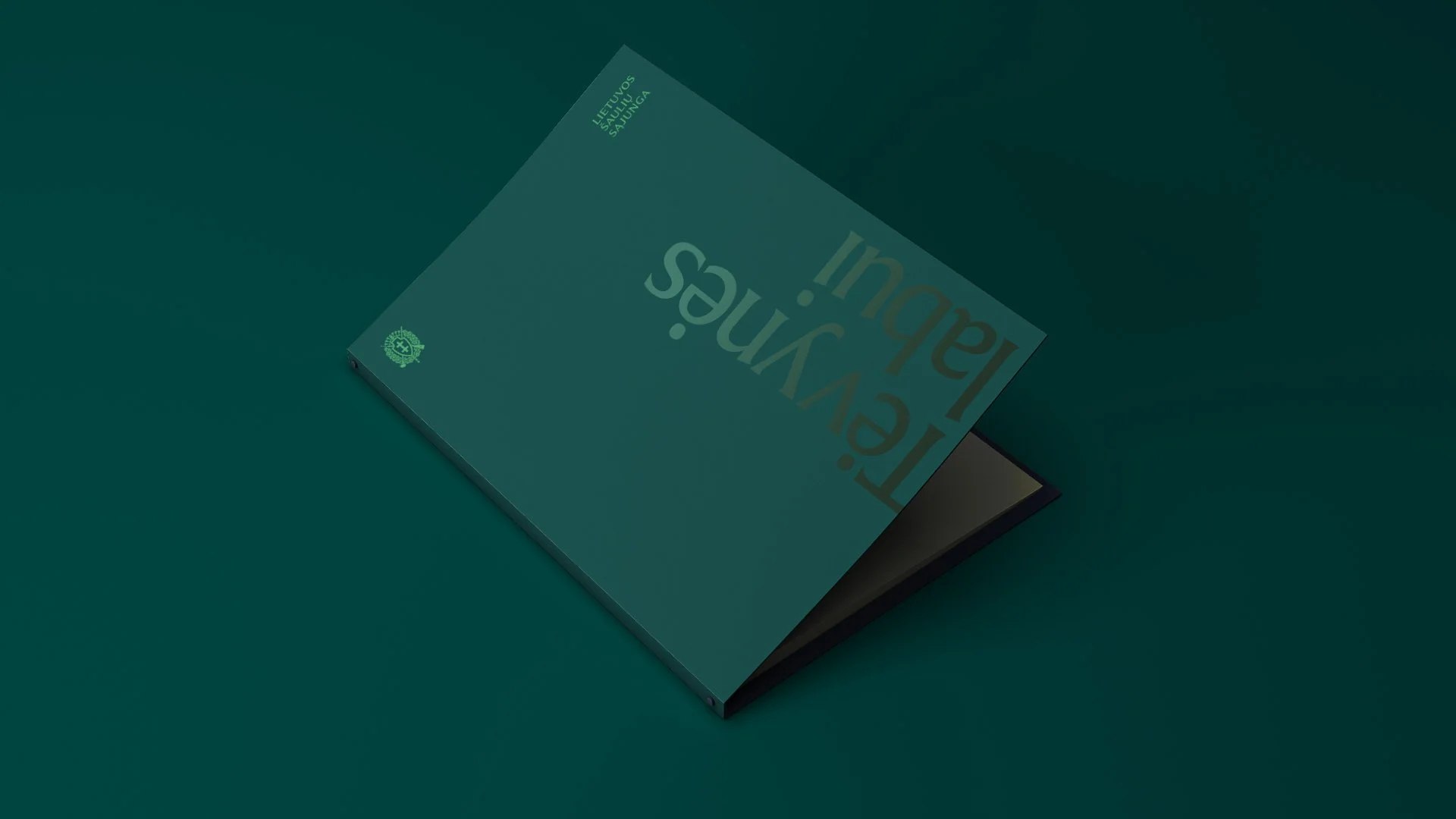
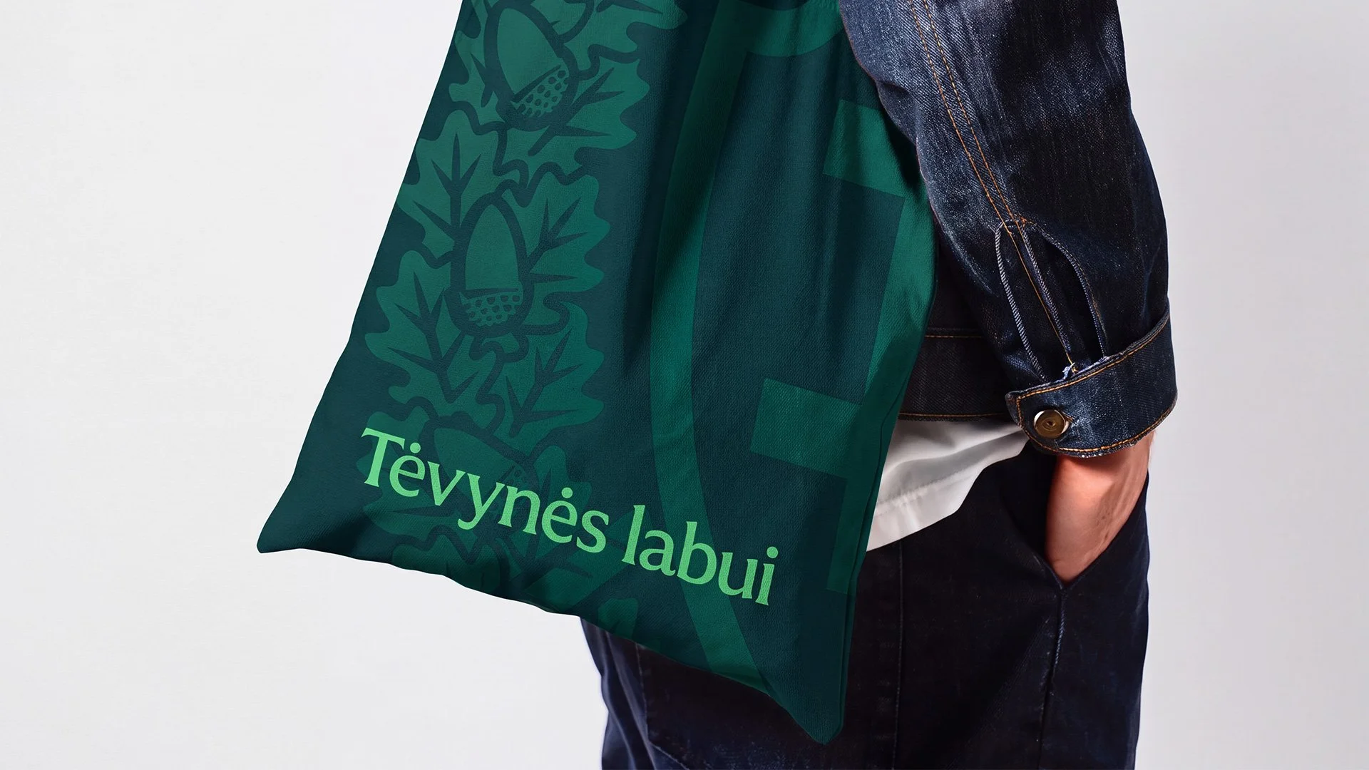
The visual language extends beyond the logo. An enlarged coat of arms serves as a background motif, while the phrases “Tėvynės labui” (For the Fatherland) and “Tapk šauliu” (Become a Rifleman) become graphic elements in their own right.
Photography adds a human dimension to the identity. Natural light, close-up portraits and relaxed poses create an authentic, approachable feel. People from different fields and backgrounds reflect the diversity of the Union’s members and their individual contributions to the organisation.
The identity was applied across a wide range of touchpoints, including print materials, social media, presentations, roll-up banners, flags, tents, vehicles and even stationery.
Branding
Visual Identity
Logo
What’s Golden?
The identity balances authority with a sense of life and belonging. Its colour pairings and flexible grid create a consistent visual language while allowing regional units to express their individuality through their own shields and colour combinations.
The same system works across very different contexts, from ceremonial documents to recruitment campaigns and social media stories. And duality is more than just the concept behind the design: it is built into the visual language itself, from contrasting colours and graphic elements to the spiral-bound brochure, whose pages open in two halves.
Credits
Agency: Great & Golden
Art direction & design: Julija Stasiulaitė
Project Manager: Lilė Adomaitė
Great&Golden © 2024