
Lithuanian Mint
Task & Challenge
Lithuanian Mint (Lietuvos monetų kalykla) is a state owned company founded in 1990. It is responsible for minting Lithuania’s circulation and collector coins.
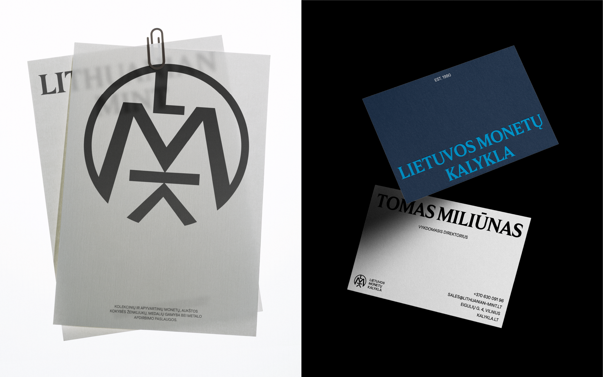
The challenge was to create a new visual identity using only the existing logo as a starting point. This meant developing a full system of colours, fonts, graphic elements and product presentation. The goal was to make the coins stand out and give the brand a fresh, more modern look.
Solutions
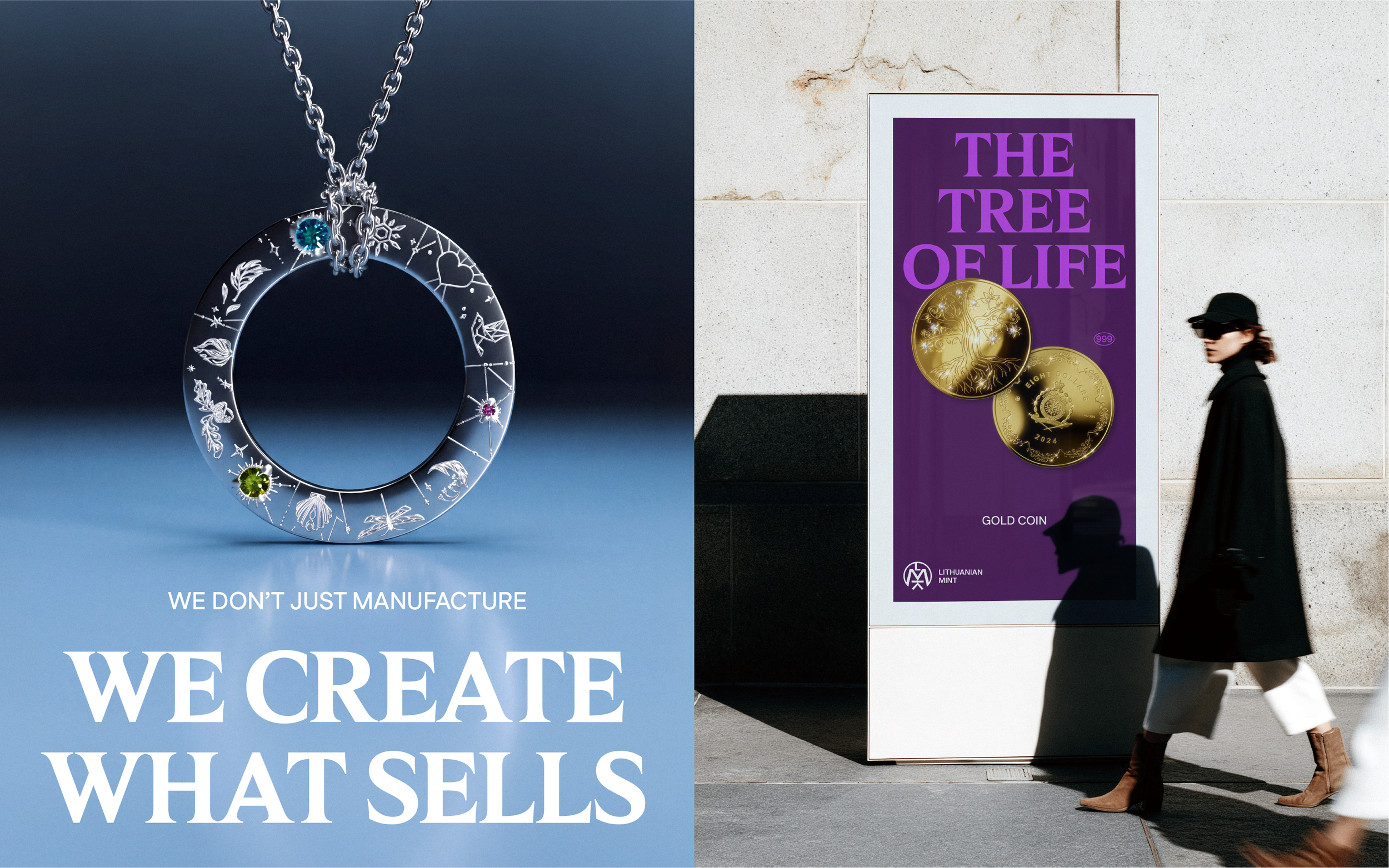
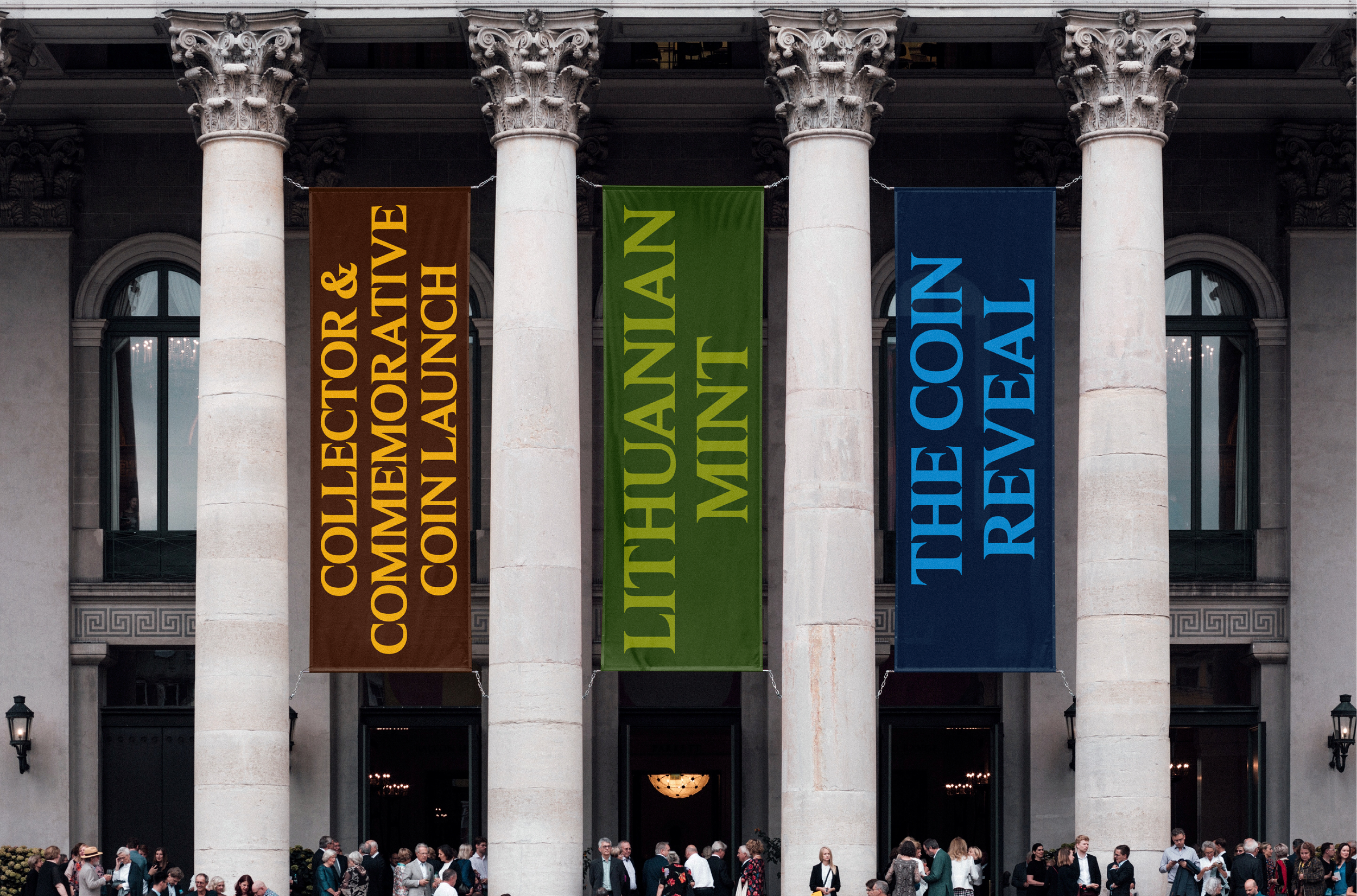
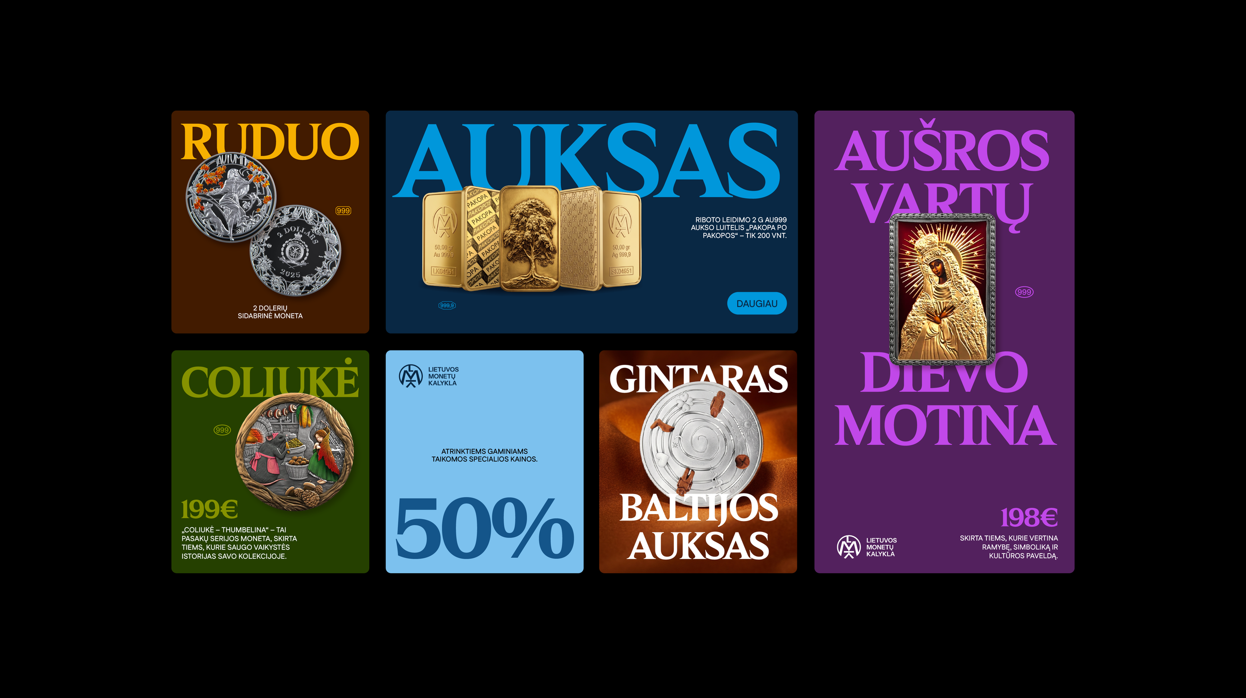
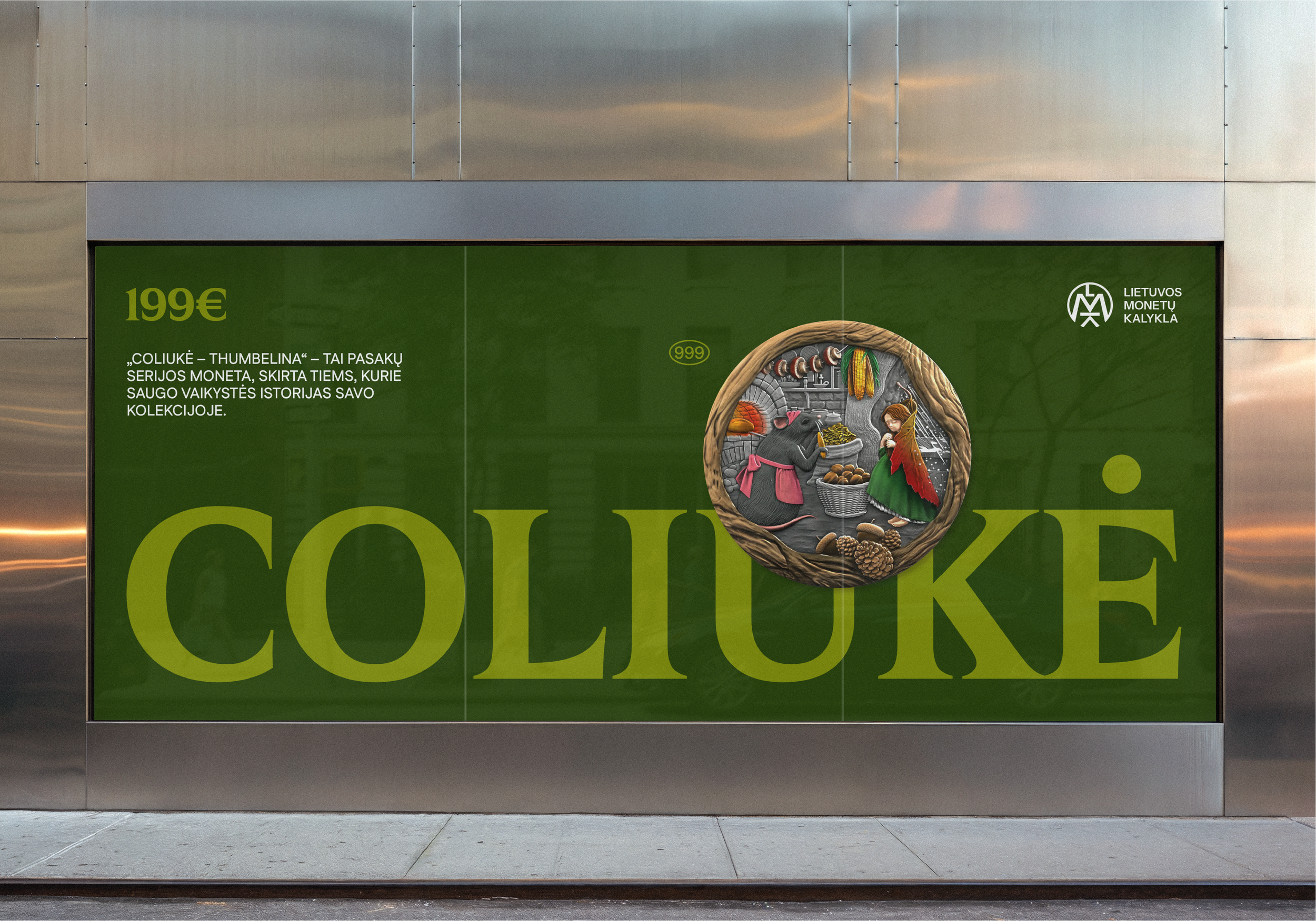
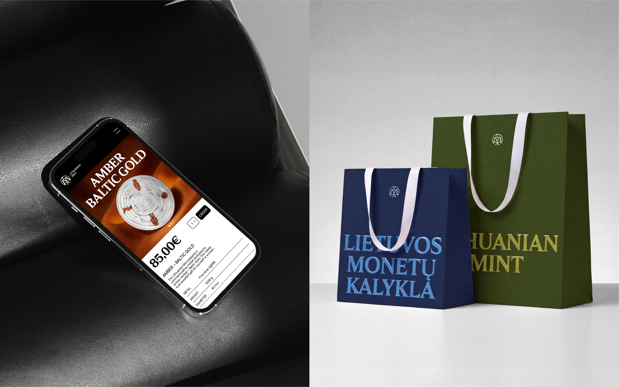
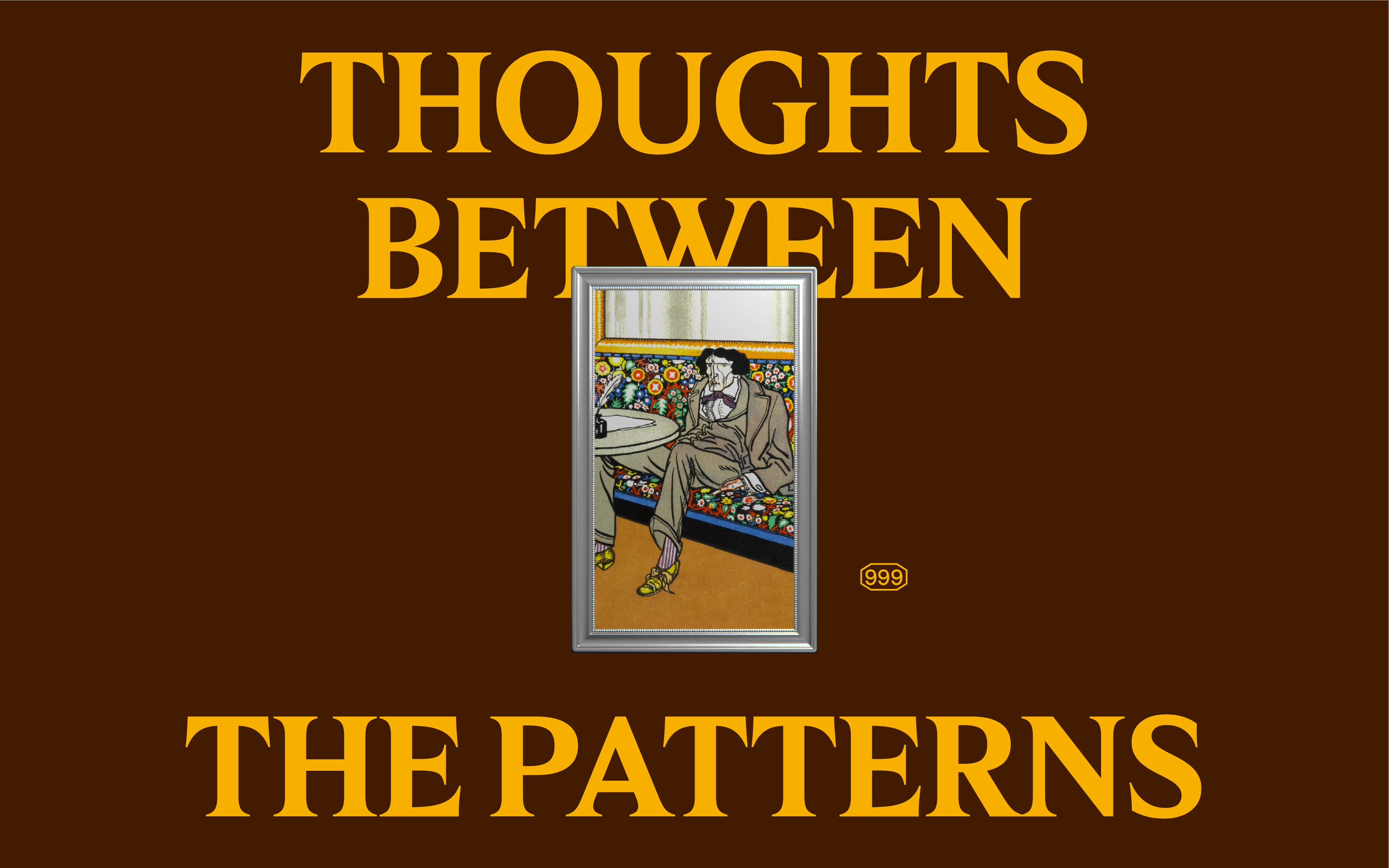
The new visual identity puts the products first, making the coins the main focus. Bold typography, rich colours and strong contrasts give the identity a bold yet elegant feel.
The dark, rich colours communicate quality and trust. The fineness mark signals high quality and gives customers confidence in what they’re buying. Product images and large headlines work together to create eye-catching visuals.
The system is flexible and works across different formats, from social media posts to posters and other promotional materials, keeping the brand consistent everywhere.
Branding
Visual Identity
Logo
Branding
What’s Golden?
The new visual identity gives the Lithuanian Mint a more modern and distinctive look. By putting the products in the spotlight and presenting them in a bold, eye-catching way, the brand stands out from its competitors.
Credits
Agency: Great & Golden
Art direction & design: Edvinas Jekimovas
Project Manager: Daumantas Kairys
Great&Golden © 2026