
NUNU
Task & Challenge
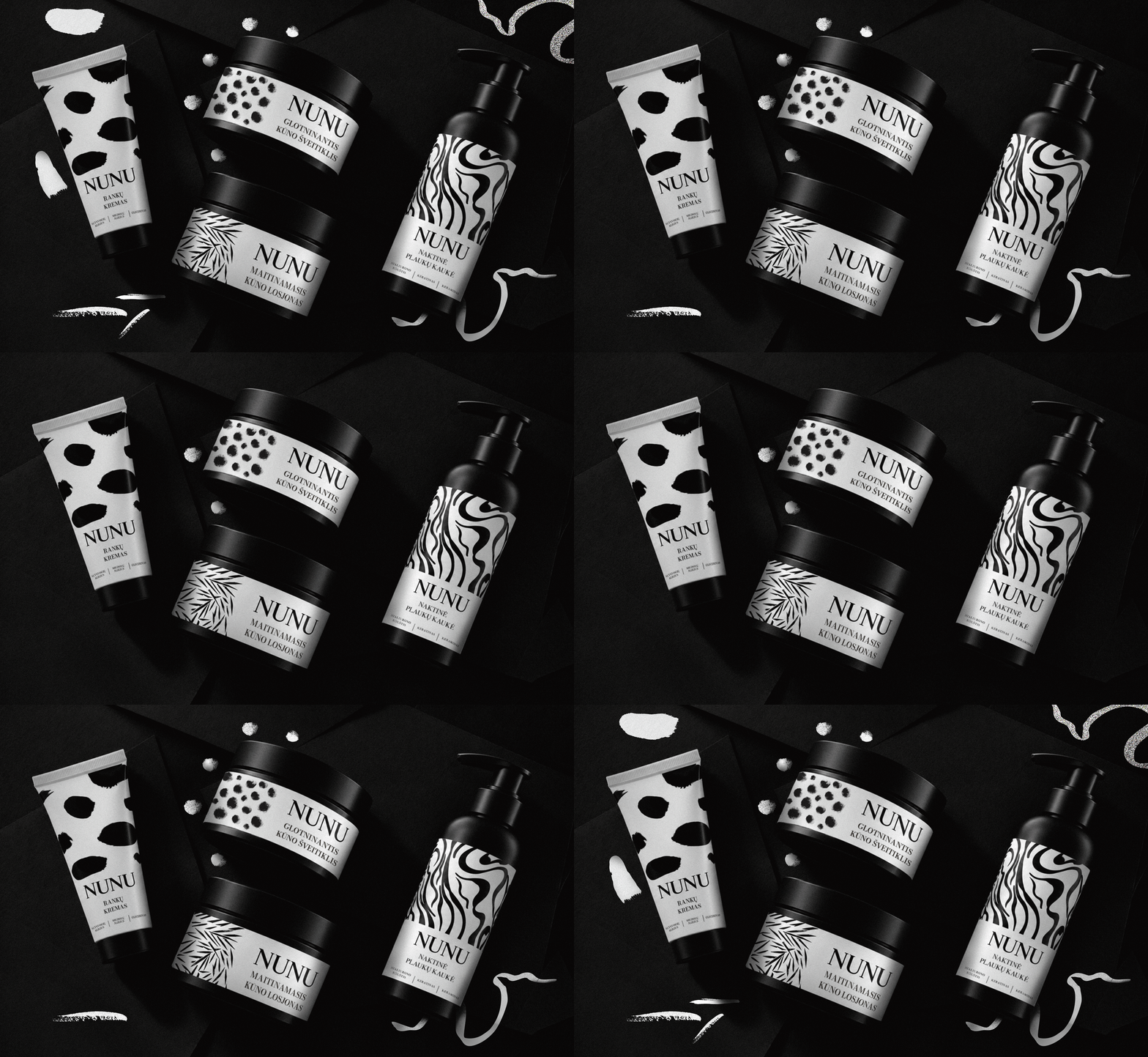
NUNU is a well known brand developed by Simona Nainė. We were entrusted with creating packaging for its body and hair care products, with a clear brief: minimalist design with a distinctive edge. The challenge was to build a recognisable packaging system that would work across different formats, from tubes and jars to pumps and sprays, while balancing a clean aesthetic with a personal touch.
Solutions
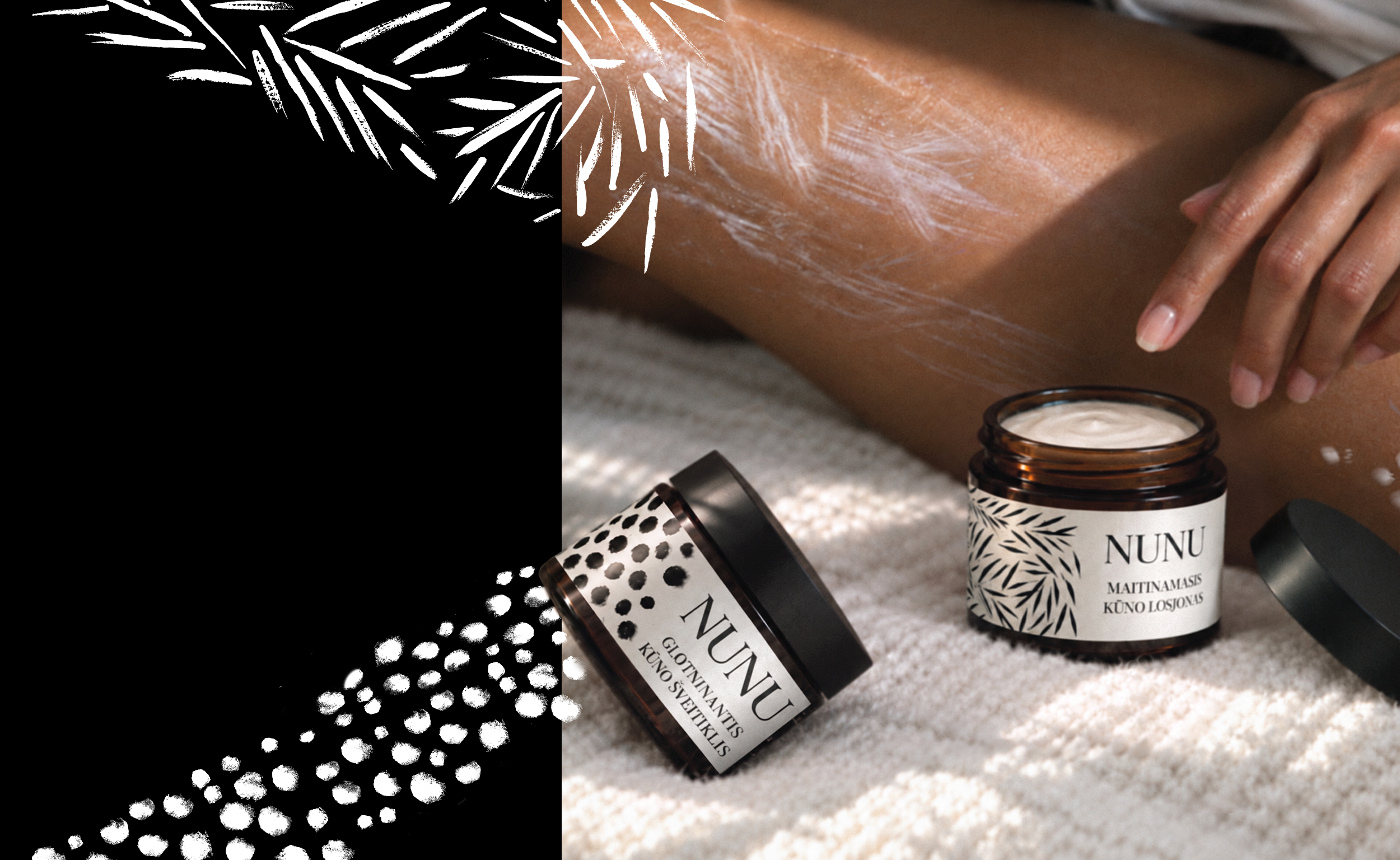
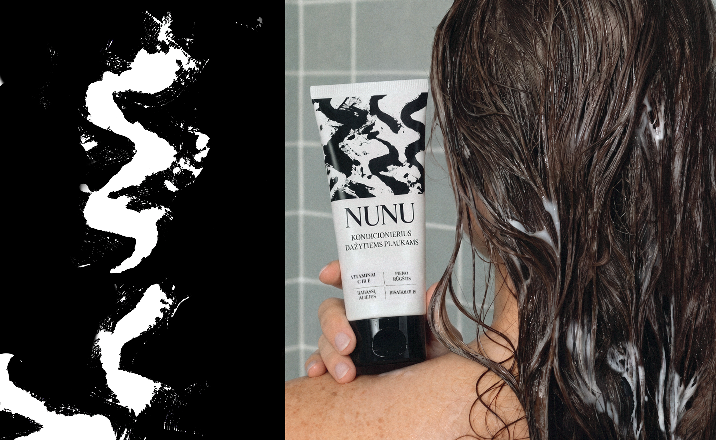
We built the packaging system around distinctive black & white patterns. Each product has its own design, while the shared visual language and NUNU wordmark bring the entire range together, creating a cohesive identity that remains easy to navigate.
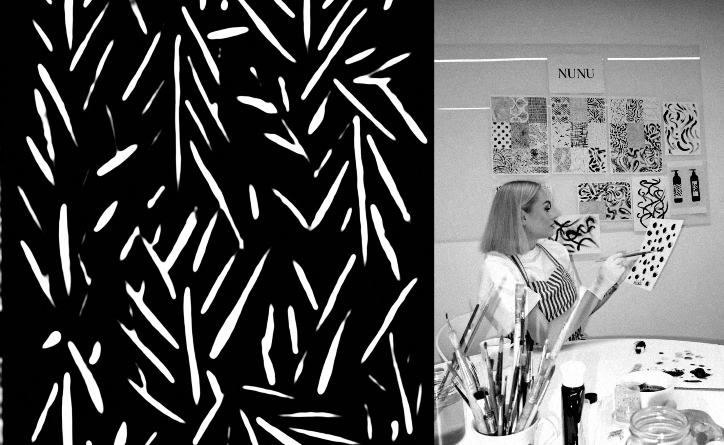
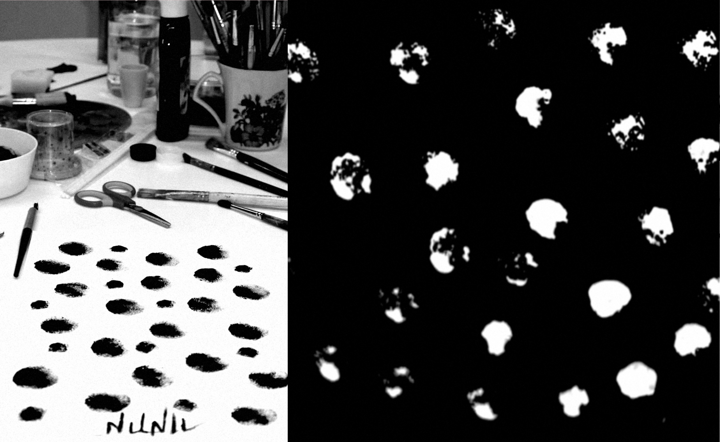
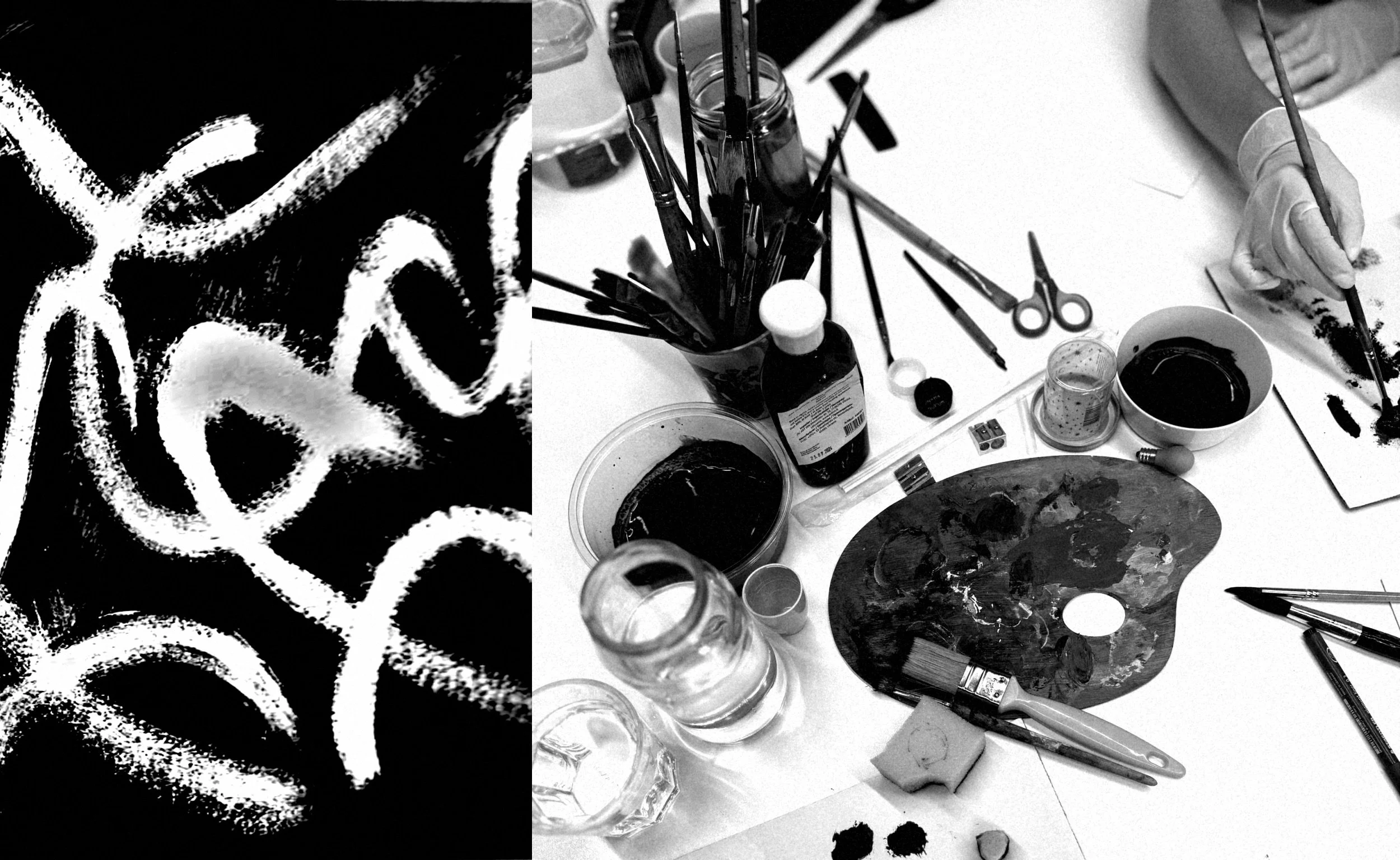
Our creative idea was to bring Simona herself into the design process. Rather than relying on generic graphic elements, we invited her to paint the patterns for each product using brushes, sponges and ink. Her original artwork was then digitised and developed into an extensive pattern library, giving the range room to grow while maintaining a consistent visual identity.
The result is a flexible packaging system that combines minimalism with a personal, human touch.
Art Direction
Packaging
Packaging System
What’s Golden?
NUNU makes minimalism personal. Every package carries the trace of a real hand, from expressive brushstrokes and sponge marks to painted leaves. By involving Simona in the creative process, we created a visual language that feels authentic to the brand and its founder. The pattern library also makes the system scalable, allowing new products to join the range without losing its distinctive character or visual coherence.
Credits
Art Direction & Graphic Design: Tatjana Sokolova
Project manager: Lilė Adomaitė
Great&Golden © 2025